-1.png?height=120&name=formrun_logo%20(3)-1.png)
This page compiles sample code that is useful when creating forms.
The following uses formrun.js.
By using formrun.js, you can set up the necessary validation and EFO (Entry Form Optimization) for common forms with just HTML markup.
- How to Set Up
- Validation
- Phone Number Validation
- Setting the Maximum Digits for Phone Number Entry
- Email Address
- Re-entering Email Address
- Number Validation
- Required Validation
- Address Completion by Postal Code
- Automatic Setting of Prefecture Tags
- Changing Button Label While Sending
- Changing the Button Label When There's an Error
- Changing the Button Label When There are Unfilled Fields or Input Mistakes
- Display Elements When a Field Has an Error
- Display Elements When a Field Has No Errors
- Add a Class When a Field Has an Error
- Add a Class When a Field Has No Errors
- Validation for Maximum and Minimum Digits of Input
-
Confirmation Mode
-
Save Form In-Progress
-
Demo Functionality
-
Frequently Asked Questions Regarding Code Types
How to Set Up
If you want to utilize the functionalities on this page, you need to load the below formrun.js inside the <head> and assign the "formrun" class to the Form tag.
<head>
...
<script src="https://sdk.form.run/js/v2/formrun.js"></script>
</head>
<body>
...
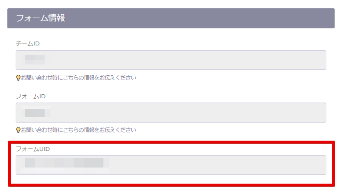
<form class="formrun" action="https://form.run/api/v1/r/<Form UID>" method="post">
...
</form>
...
</body>
<!-- Markup example -->
<input type="text" name="Phone Number" data-formrun-type="tel">
Specify the data-formrun-chars-max attribute in the tag. (You also need to set data-formrun-type="tel" )
By specifying it, you can set the maximum number of digits for text input.
Note: The minimum number of digits is preset by formrun, so you cannot set it dynamically.
<!-- Markup example -->
<input type="text" class="form-control" id="tel" name="Phone Number"
data-formrun-type="tel"
data-formrun-chars-max="10">
Specify the data-formrun-type="email" attribute in the tag.
By doing so, you will set validation for the input field to only accept email addresses.
An error will occur if anything other than an email address is entered.
<!-- Markup example -->
<input name="Email Address" type="text" data-formrun-type="email">
<div data-formrun-show-if-error="Email Address">Please enter a valid email address</div>
Specify the data-formrun-type="email_confirmation" attribute in the tag.
Also specify the value of the name attribute of the email address tag you want to match in data-formrun-confirmed-name.
<input name="Email Address_confirm" data-formrun-type="email_confirmation" data-formrun-confirmed-name="Email Address">
<div data-formrun-show-if-error="Email Address_confirm">Email addresses do not match</div>
If you want to specify a validation for only numbers between a maximum of 100 and a minimum of -100,
Specify the tag with data-formrun-type = "number" max = "100" min = "-100" attributes.
By doing so, you will set validation for the input field to only accept numbers.
An error will occur if a number outside the specified range is entered.
<!-- Markup example -->
<input type="number" data-formrun-type="number" max="100" min="-100" name="Quantity" >
Specify the data-formrun-required attribute in the tag.
By doing so, you will make the input field required.
Empty text fields, unselected radio buttons, checkboxes, and select boxes will result in an error.
<!-- Markup Example -->
<input type="text" name="Name" data-formrun-required>
Specify the data-formrun-type="postal-code-jp" attribute in the tag.
Entering a postal code will reflect the corresponding address in the relevant fields.
Specify the fields corresponding to the address with
data-formrun-type="region locality street-address" .
Here, 'region' corresponds to the prefecture, 'locality' to the city/town/village, and 'street-address' to the town name.
If no corresponding town name is found, it will be left blank.
By entering the values of data-formrun-type separately, you can accommodate multiple address fields.
<!-- Markup Example 1 (When consolidating the address into one field) -->
<input type="text" name="Postal Code" data-formrun-type="postal-code-jp">
<input type="text" name="Address" data-formrun-type="region locality street-address">
<!-- Markup Example 2 (When splitting the address into multiple fields) -->
<input type="text" name="Postal Code" data-formrun-type="postal-code-jp">
<input type="text" name="Address" data-formrun-type="region">
<input type="text" name="Address" data-formrun-type="locality street-address" >
Specify the
data-formrun-type="prefecture-jp" in the Select tag.
By using this feature, <option> tags enumerating the prefectures will be set automatically, eliminating the need to write <option> tags.
By using this setting with data-formrun-type="region" , you can also use the auto-complete feature based on the postal code.
<!-- Markup Example -->
<input type="text" name="Postal Code" data-formrun-type="postal-code-jp">
<select name="Prefecture" data-formrun-type="region prefecture-jp"></select>
Specify the data-formrun-submitting-text attribute in the button tag.
Upon form submission, this changes the label of the button.
It helps prevent double submissions and improves user experience.
<!-- Markup Example -->
<button type="submit" class="btn btn-primary" data-formrun-submitting-text="Submitting...">Submit</button>
Specify the data-formrun-error-text attribute in the button tag.
If there is an error in the form, this changes the label of the button.
It enhances user experience as users can recognize errors before submission, reducing user drop-offs.
<!-- Markup Example -->
<button type="submit" class="btn btn-primary" data-formrun-error-text="There are unfilled fields">Submit</button>
Specify the data-formrun-not-input-error-text attribute and the data-formrun-invalid-input-error-text attribute to the tag. (You need to specify both attributes together.)
When specified, if there are fields in the form that are not filled in or if there are fields with incorrect input (validation check errors), it will change the label of the submit button.
Since you can check if there is an input error before submitting, it has the effect of improving usability.
<!-- Markup example -->
<button
type="submit"
class="sf-btn sf-submit-btn sf-btn-block sf-btn-lg"
data-formrun-invalid-input-error-text="There are fields that are not correctly filled in."
data-formrun-not-input-error-text="There are fields that are not filled in."
>Submit</button>
Specify the data-formrun-show-if-error=<FieldName> attribute to the tag.
When specified, it will be displayed when the field specified in FieldName has an error.
In the example below,
if you leave the "お名前" (name) field blank,
the message "Please enter your name correctly" will be displayed.
<!-- Markup example -->
<input type="text" name="お名前" data-formrun-required>
<div data-formrun-show-if-error="お名前">Please enter your name correctly</div>
Specify the data-formrun-show-if-success=<FieldName> attribute to the tag.
When specified, it will be displayed when the field specified in FieldName has no errors.
In the example below,
when you input a string into the "お名前" (name) field, the "ok.png" image will be displayed.
<!-- Markup example -->
<input type="text" name="お名前" data-formrun-required>
<img src="ok.png" data-formrun-class-if-success="お名前" />
Validation for maximum and minimum number of input characters
Specify the data-formrun-chars-max attribute to the tag. (You also need to specify data-formrun-type="text" together.)
When specified, you can set the maximum number of characters for text input.
<!-- Markup example Single line text-->
<input type="text" class="form-control" id="name" name="お名前"data-formrun-type="text"
data-formrun-chars-max="10">
<!-- Markup example Text area-->
<textarea class="form-control" id="body" name="お問い合わせ"data-formrun-type="text"
data-formrun-chars-max="20"
></textarea>
Specify the data-formrun-chars-min attribute to the tag. (You also need to specify data-formrun-type="text" together.)
When specified, you can set the minimum number of characters for text input.
<!-- Markup example Single line text-->
<input type="text" class="form-control" id="name" name="お名前"
data-formrun-type="text"
data-formrun-chars-min="7">
<!-- Markup example Text area-->
<textarea class="form-control" id="body" name="お問い合わせ"
data-formrun-type="text"
data-formrun-chars-min="2"
></textarea>
Confirmation Mode
Specify the data-formrun-confirm="true" attribute to the Form tag.
When specified, you can set up a confirmation page for the form.
Normally, data is directly sent when a form is submitted without going through a confirmation page.
By setting up a confirmation page, users can review the fields they have entered before submitting.
When using a confirmation page,
in addition to the usual submit button, it is mandatory to set up a "back" button with the data-formrun-back-button attribute.
<!-- Markup example -->
<form class="formrun" action="#" method="post" data-formrun-confirm="true">
...
<a href="javascript:void(0)" class="btn btn-default" data-formrun-back-button>Back</a>
<button type="submit" class="btn btn-primary">Confirm</button>
</form>
Specify the data-formrun-show-if-confirm attribute to the tag.
If specified, the element will only be displayed during the confirmation page mode.
<!-- Markup example -->
<form class="formrun" action="#" method="post" data-formrun-confirm="true">
<div data-formrun-show-if-confirm>
Please check the data carefully before submitting.
</div>
...
</form>
Specify the data-formrun-hide-if-confirm attribute to the tag.
If specified, the element will only be hidden during the confirmation page mode.
<!-- Markup example -->
<form class="formrun" action="#" method="post" data-formrun-confirm="true">
<div data-formrun-hide-if-confirm>
Please enter the data and press the confirm button.
</div>
...
</form>
When specified, it will display the values of the targeted fields during the confirmation page mode.
By using data-formrun-show-if-confirm together, you can layout the display during the confirmation page mode.
<!-- Markup example -->
<input type="text" name="Name">
<div class="col-xs-9" data-formrun-show-if-confirm>
<span data-formrun-confirm-value="Name"></span>
</div>
Save the form halfway
Specify the data-formrun-saving="true" attribute to the Form tag.
If specified, the information entered in the form will be temporarily saved, and even if the browser is accidentally closed, the entered information will be there when the form is reopened.
The saved information will be deleted when the form is submitted.
<!-- Markup example -->
<form class="formrun" action="#" method="post" data-formrun-saving="true">
...
</form>
Spam Prevention
- Access the "reCAPTCHA" settings page
First, please access the following site.
reCAPTCHA: Easy on Humans, Hard on Bots - Set up "reCAPTCHA"
Referring to the figure below, fill in and select fields ① to ④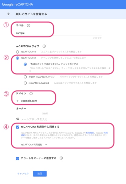
- Copy the "reCAPTCHA" Secret Key
Copy the "reCAPTCHA" Secret Key created in step 2. - Enter the Secret Key
Enter the Secret Key you copied in step 3 in the form settings page. - Install the following tag in the embedding destination page's HTML
Add before the end tag of the HTML header:
<script src='https://www.google.com/recaptcha/api.js'></script>
Insert the tag where you want to display the Recaptcha within the form tag:
<div class="g-recaptcha" data-sitekey="your google recapcha site key"></div>
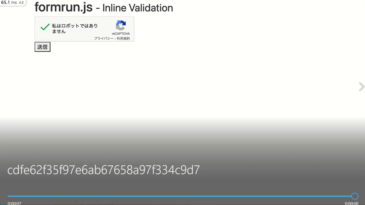
Enable button when reCAPTCHA is checked
- Specify the data-callback attribute in the tag. Assign a function that enables the button when reCAPTCHA is checked.
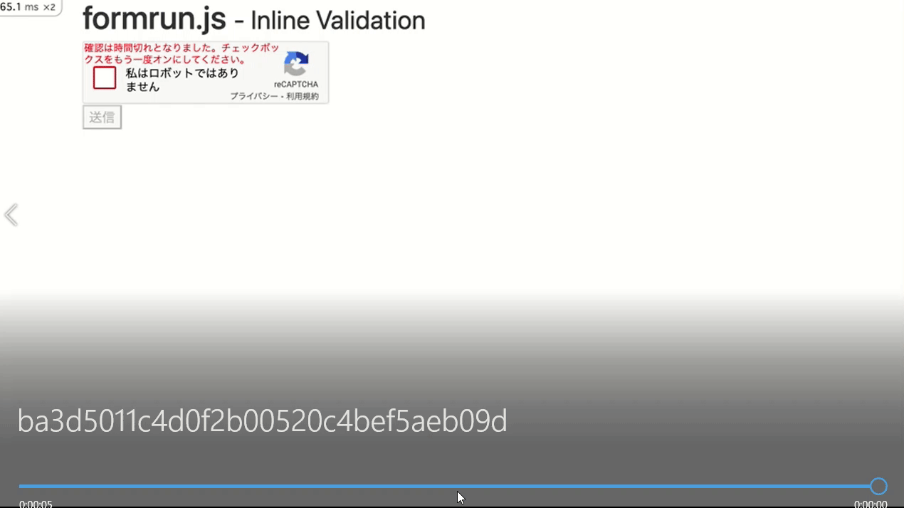
- Specify the data-expired-callback attribute in the tag. Assign a function that disables the button when the reCAPTCHA expires.
- Assign the disabled attribute to the submit button.
- Prepare functions in the Script tag to enable and disable the submission button.
Behavior at the time of checking
Behavior when the validity period expires
※ Please be sure to add
<script src='https://www.google.com/recaptcha/api.js'></script>
before the end tag of the HTML header.
<!-- Markup example -->
<div class="g-recaptcha"
data-sitekey="your google recapcha site key"
data-callback="verifyCallback"
data-expired-callback="expiredCallback"
></div><button type="submit" data-formrun-submitting-text="Sending" disabled>Submit</button>
...
</form>
</body><script>
function verifyCallback() {
document.querySelector('button[type=submit]').removeAttribute("disabled");
}
function expiredCallback() {
document.querySelector('button[type=submit]').setAttribute("disabled", true);
}
</script>
Operation Demo
We have set up a demo for the above content here.
Use it as a reference for how it behaves during coding.
Frequently Asked Questions Regarding Code Types
By adding [] after "name=XXX",
both data will be sent when multiple options are selected.
If you haven't added [] after "name=XXX",
even if you select multiple options, only one piece of data will be sent. Please be aware.
<!-- Markup example -->
Favorite fields
The two steps you need to follow when setting up a file upload field are:
- Adding enctype="multipart/form-data" to the <form> tag
- Adding the <input type="file"> tag
<form class="formrun" action="https://form.run/api/v1/r/xxxxx" method="post" enctype="multipart/form-data">
<input type="file" name="Attachment">
<button type="submit">Submit</button>
</form>
When Only the Filename Is Displayed and the File Isn't Properly Displayed After Upload
If, in the file upload field, the respondent has uploaded a file but only the filename is displayed, please check the following two points:
- method="post"
- enctype="multipart/form-data"
<!-- Markup example -->
<form action="formrun url" method="post" enctype="multipart/form-data">