-1.png?height=120&name=formrun_logo%20(3)-1.png)
Functions and features that can be configured for each added item in the form.
※ Please use Ctrl+f to find the field you want to check
- Advanced Features
- Block
- Others
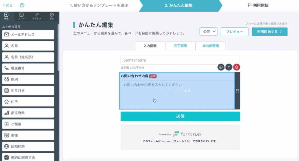
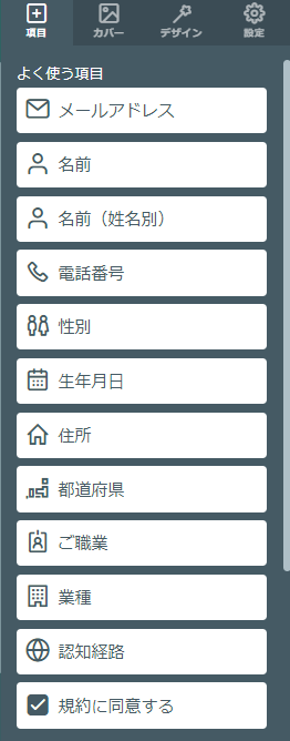
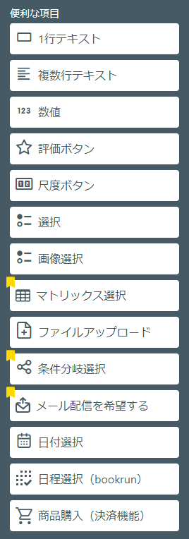
Frequently Used Fields
The basic fields are as follows. Click on each field to go to the edit page.
For information about error messages when invalid values are entered for frequently used fields, please check here.
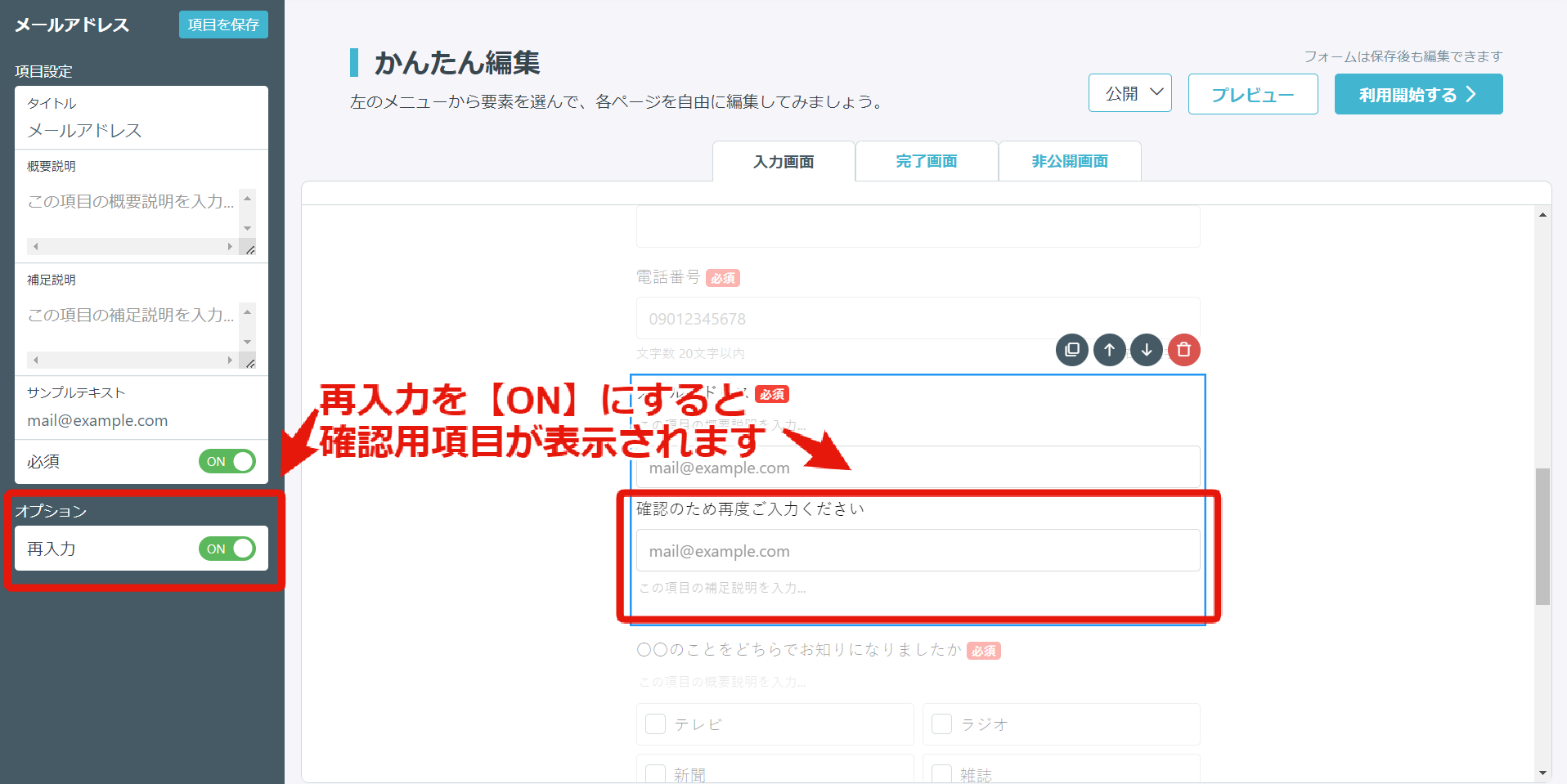
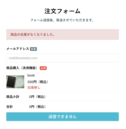
This is an field where you can enter an email address.
After adding the "Email Address" field, when you click on the component, the "Field Settings" will be displayed.
By turning on the optional "Re-entry," you can add a confirmation field to prevent input mistakes/spelling mistakes in the email address.
Also, in the EFO settings, by turning on "Half-width Automatic Conversion,"
you can automatically convert full-width alphanumeric characters, at signs, and hyphens entered into half-width characters.
Spaces will also be automatically deleted, reducing input mistakes by form respondents.
Please see here for the setup method.
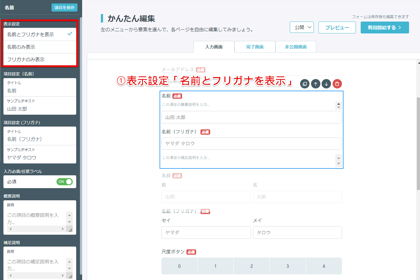
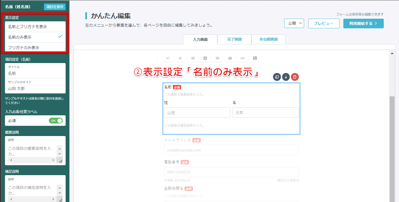
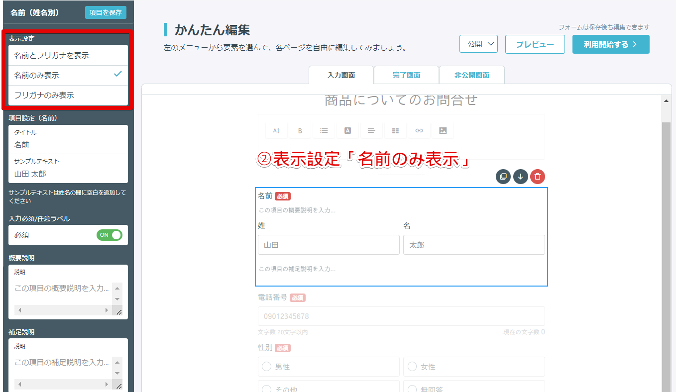
This is an field where you can enter your name.
You can select from three display settings: "Display Name and Furigana," "Display Name Only," and "Display Furigana Only."
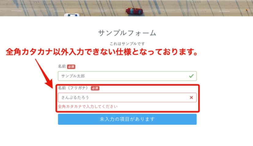
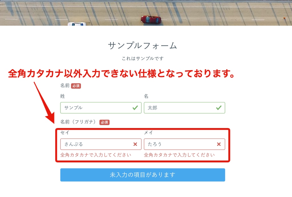
※ In the furigana field, you can only enter full-width katakana.
The image of each display setting is as follows.
By turning on "Automatic Furigana Input" in the EFO settings,
if you select "Display Name and Furigana," you can use the automatic furigana input function.
When the form respondent enters their name in kanji, the katakana furigana will be automatically entered at the same time, saving the form respondent's input effort.
Please see here for the setup method.
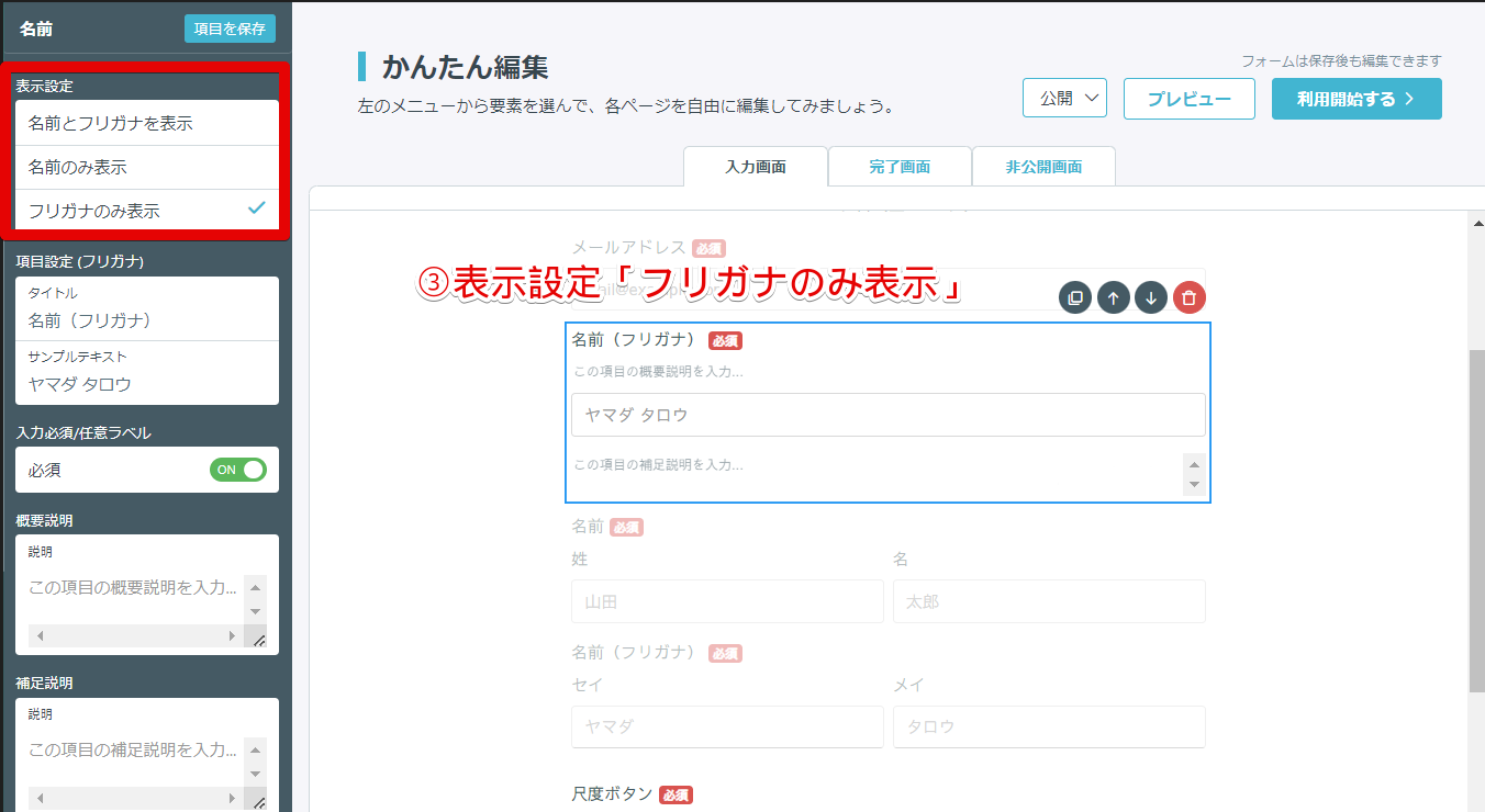
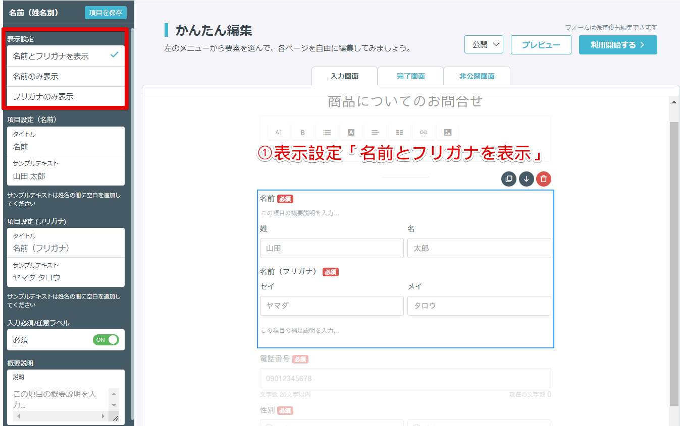
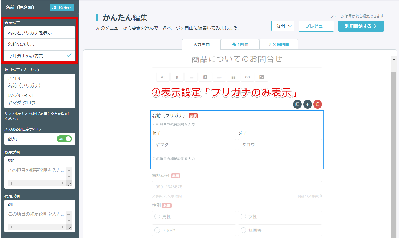
This is a function where you can enter your name, separating it into last name and first name.
You can select from three display settings: "Display Name and Furigana," "Display Name Only," and "Display Furigana Only."
※ In the furigana field, you can only enter full-width katakana.
The image of each display setting is as follows.
By turning on "Automatic Furigana Input" in the EFO settings,
if you select "Display Name and Furigana," you can use the automatic furigana input function.
When the form respondent enters their name in kanji, the katakana furigana will be automatically entered at the same time, saving the form respondent's input effort.
Please see here for the setup method.
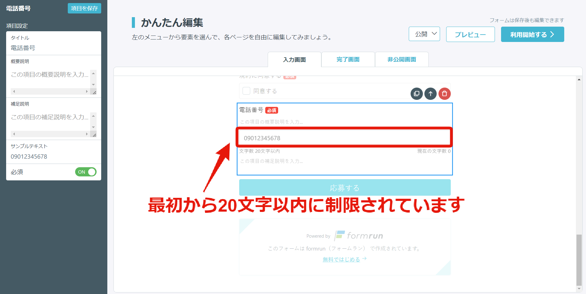
This is a function where you can enter a phone number.
The maximum number of digits that can be answered is 20 characters.
Only the symbols "()", "+", and "-" and half-width numbers from 0 to 9 can be entered.
Also, in the EFO settings, by turning on "Half-width Automatic Conversion,"
you can automatically convert full-width alphanumeric characters, at signs, and hyphens entered into half-width characters.
Spaces will also be automatically deleted, reducing input mistakes by form respondents.
Please see here for the setup method.
This is a function where you can select your gender.
This is a function where you can input your date of birth in a dropdown format.
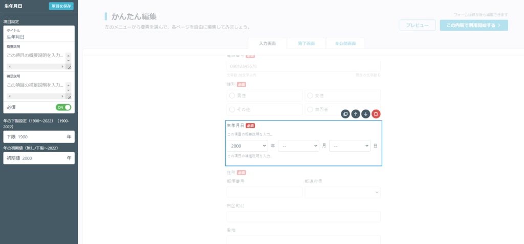
You can set a lower limit and initial value for the date. By setting this, it will make it easier for customers to input their date of birth.
Since date of birth is demographic data that represents the individual nature of the customer, please use the "Date of Birth" component for forms in BtoC (business-to-consumer) applications such as purchasing products or applying for events.
The date selection function is available in the "Convenient Fields" section.
This is a function where you can input an address.
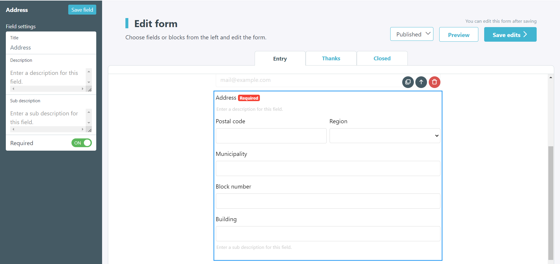
It comes with an "Address Autocompletion" feature that automatically completes the address by entering the postal code.
In the postal code field, only the symbols "()", "+", "-", and half-width numbers from 0 to 9 can be entered. Therefore, it can reduce user input effort and mistakes.
Additionally, in the EFO settings, by turning on "Half-width Automatic Conversion," you can automatically convert full-width alphanumeric characters, at signs, and hyphens entered into half-width characters. Spaces will also be automatically deleted, reducing input mistakes by form respondents. Please see [here](https://faq.form.run/faq/half-width-automatic-conversion) for the setup method.
This is a function where you can input/select a prefecture.
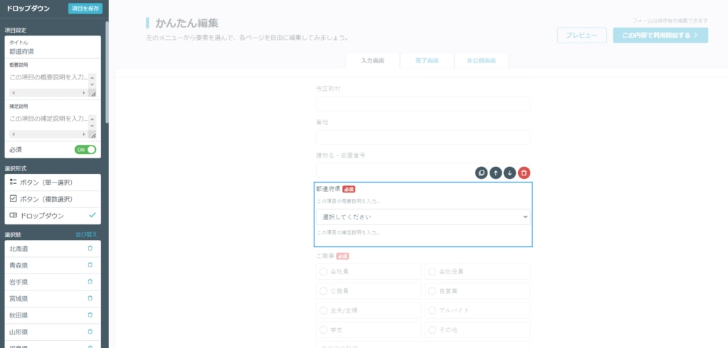
In the left menu under "Selection Fields," 47 prefectures are automatically inputted by default. If you want to select/display only specific prefectures, you can delete unnecessary fields using the trash can icon in "Selection Fields."
This is a function where you can select your occupation.
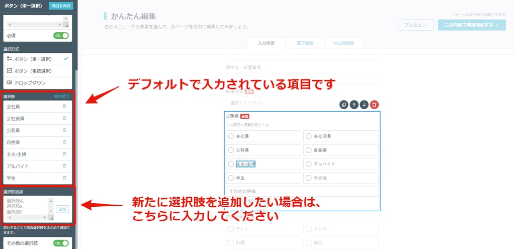
The above fields are set by default.
If you want to rearrange the order, click "Sort Selection Fields." If you want to delete, click the trash can icon in "Selection Fields." If you want to add, fill in "Add Selection Fields."
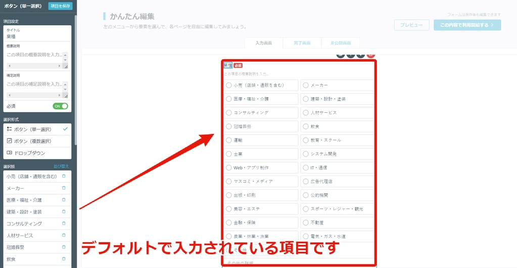
This is a function where you can select an industry.
The above fields are set by default.
If you want to rearrange the order, click "Sort Selection Fields." If you want to delete, click the trash can icon in "Selection Fields." If you want to add, fill in "Add Selection Fields."
This is a function where you can select the source of awareness.
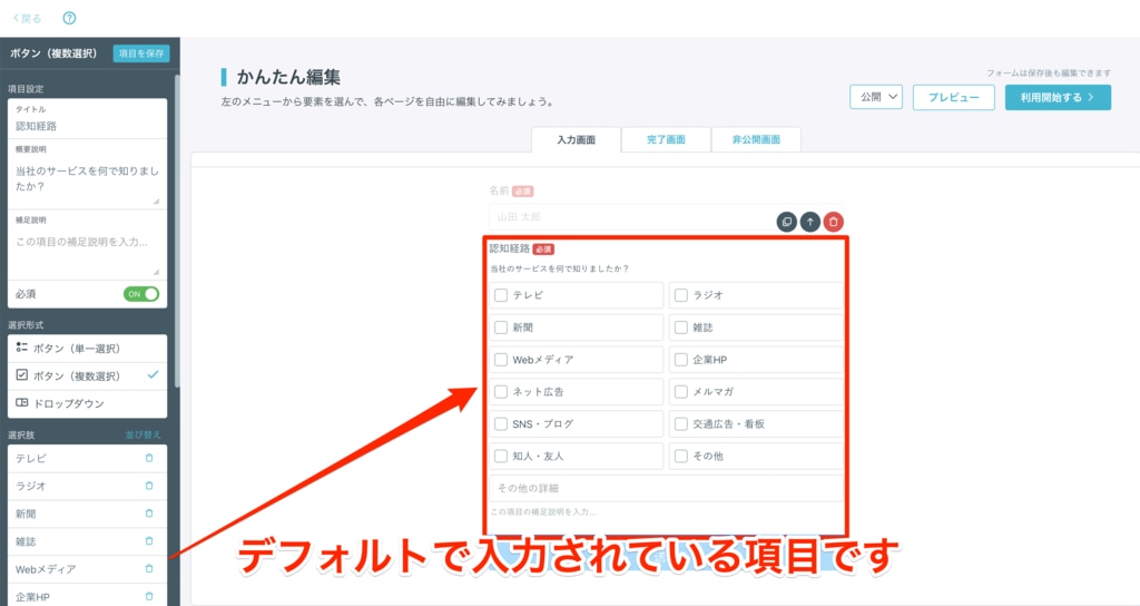
The above fields are set by default.
If you want to rearrange the order, click "Sort Selection Fields." If you want to delete, click the trash can icon in "Selection Fields." If you want to add, fill in "Add Selection Fields."
If you want to change the description text, please go to "Field Settings > Description."
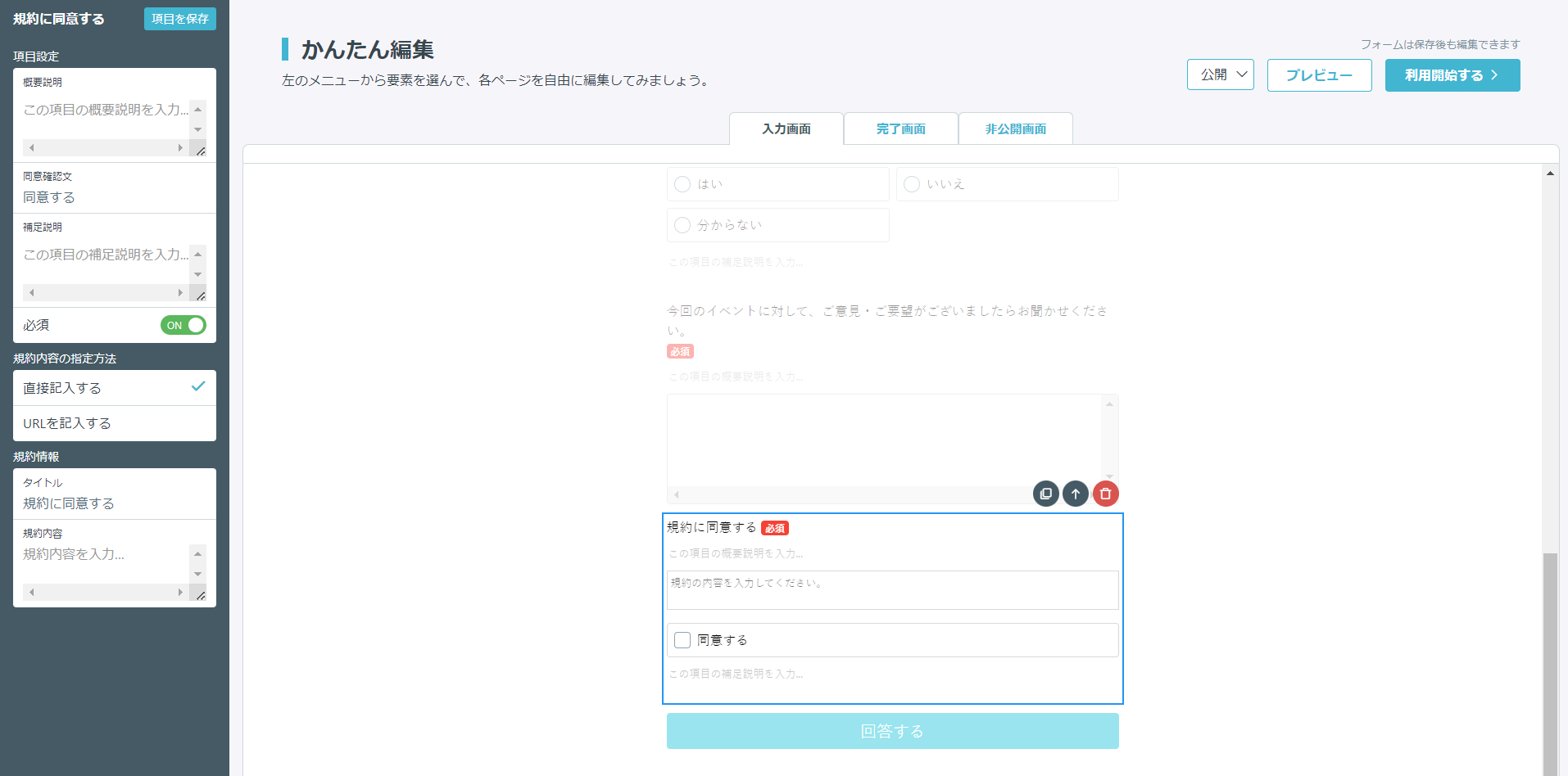
This is a function where you can input terms and conditions.
There are two ways to display the terms and conditions:
- Direct Input: Display the terms and conditions so that the content can be scrolled through.
- Input URL: Set a hyperlink for the terms and conditions.
【Installation Method】
1. Direct Input
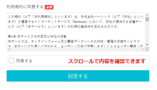
By directly inputting the terms and conditions in "Terms Information," you can display the terms and conditions content.
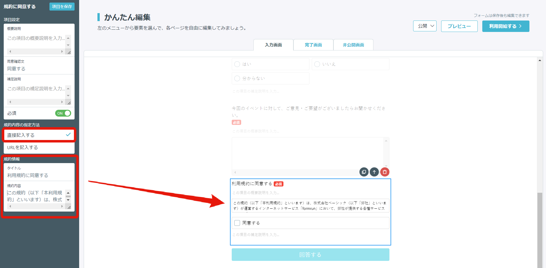
Here is an image of the public view.
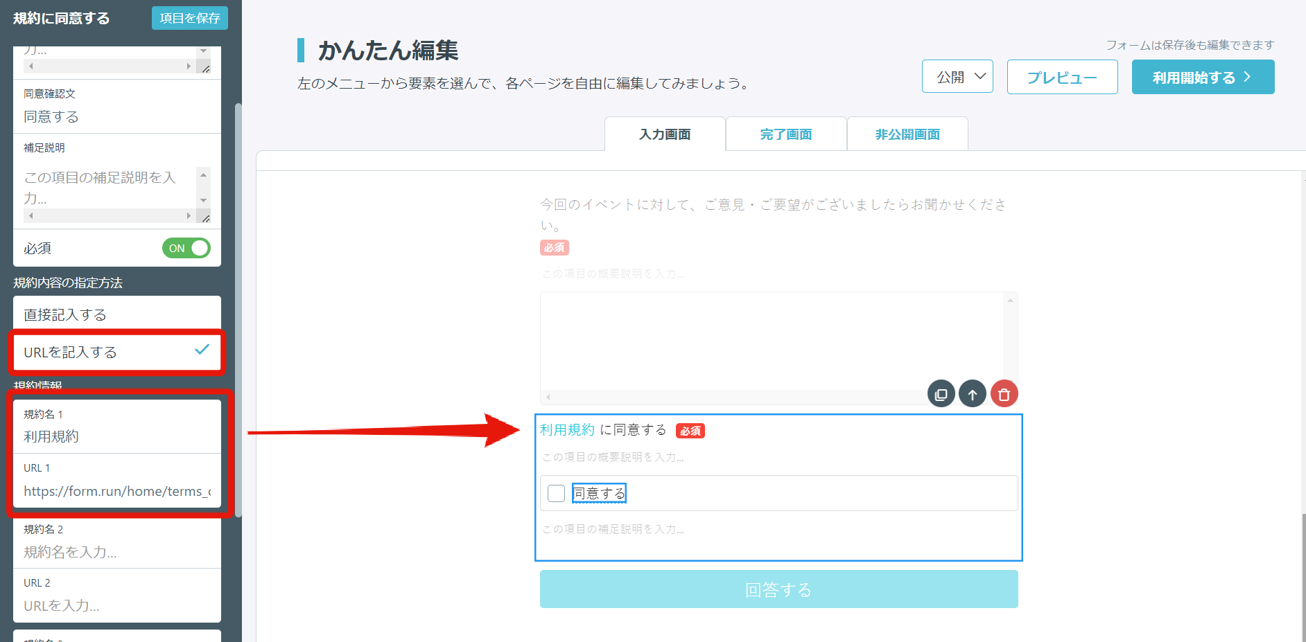
2. Input URL
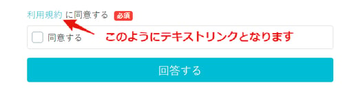
By inputting a URL in "Terms Information," you can set a text link for the terms and conditions.
※ You can input up to four sets of terms and conditions information.
Here is an image of the public view.
Here are the basic fields. Clicking on each field will install it in the editing page.
You can set the title of the input field yourself, so create fields that are not commonly used and use them when you want them to be filled in.
This is a function where end users can optionally input on a per-line basis.
If you want end users to provide answers in words or short sentences, we recommend using this field.
You can limit the number of characters in all plans and the types of characters in the [BEGINNER plan](https://form.run/home/pricing) and above.
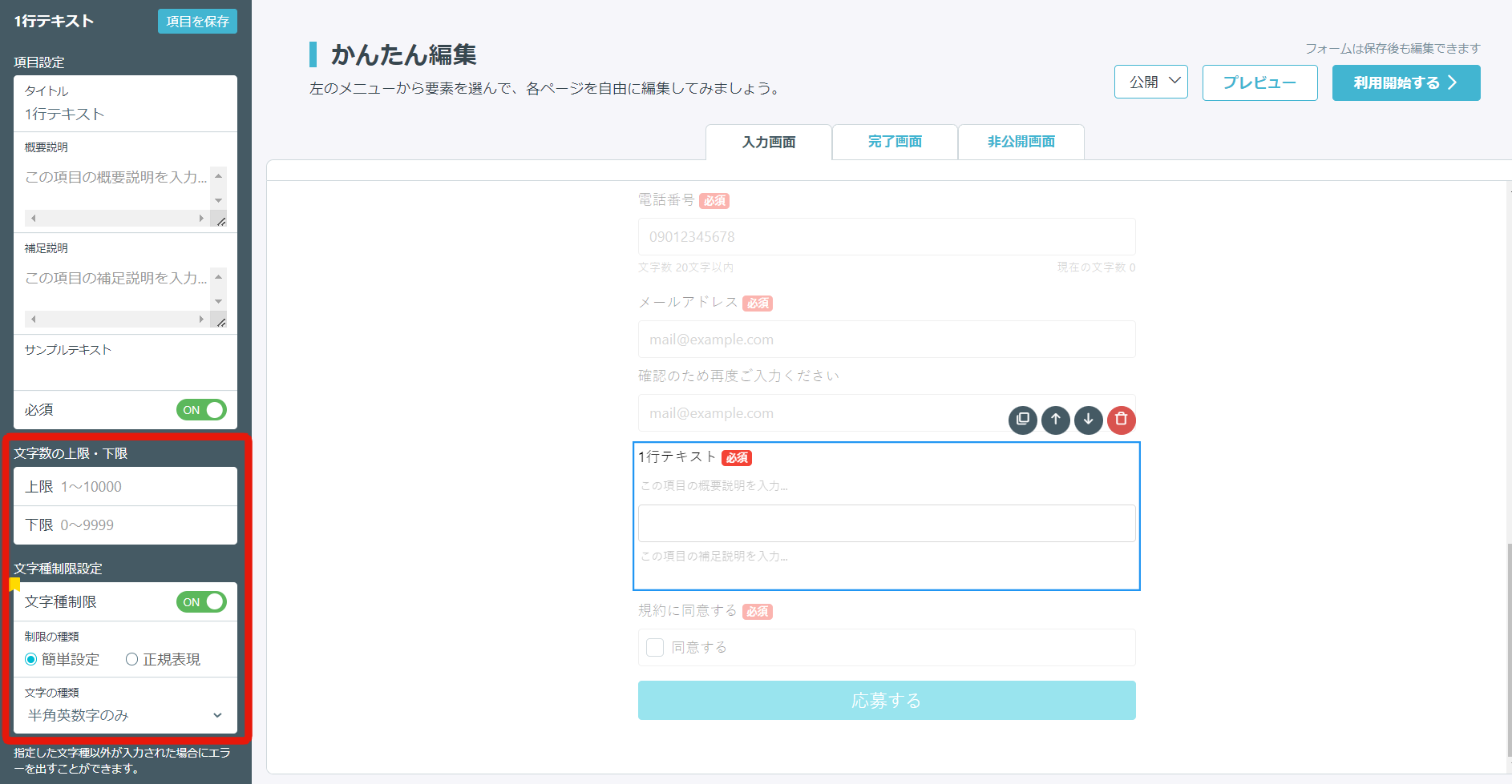
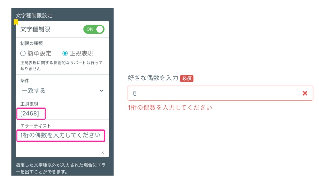
Regarding character type restrictions, you can choose from "Simple Settings" and "Regular Expressions."
In "Simple Settings," you can set the types of characters that can be entered from the following:
- Alphanumeric (half-width) only
- Numeric (half-width) only
- Alphabetic (half-width) only
- Katakana (full-width) only
- Hiragana only
In "Regular Expressions," you can set validation and error text using regular expressions. If you haven't entered anything in the error text, the error message "Please enter correctly" will be displayed.
Please note that support for "Regular Expressions" is not available.

Additionally, in the [EFO settings](https://faq.form.run/faq/efo), by turning on "Half-width Automatic Conversion," you can automatically convert full-width alphanumeric characters, at signs, and hyphens entered into half-width characters. Spaces will also be automatically deleted, reducing input mistakes by form respondents. Please see [here](https://faq.form.run/faq/half-width-automatic-conversion) for the setup method.
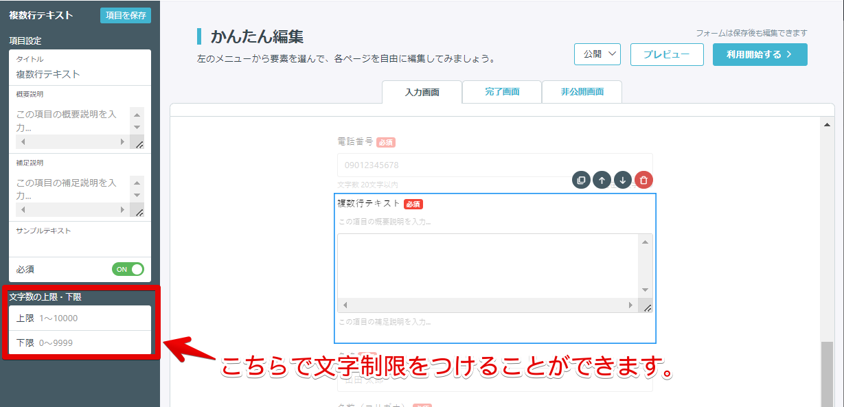
This is a function where end users can optionally input over multiple lines.
If you want end users to provide answers in paragraphs, we recommend using this field.
You can also limit the number of characters entered in the form.※ If the number of characters entered in the form does not meet the limit, an error message "Please enter at the specified number of characters" will be displayed.
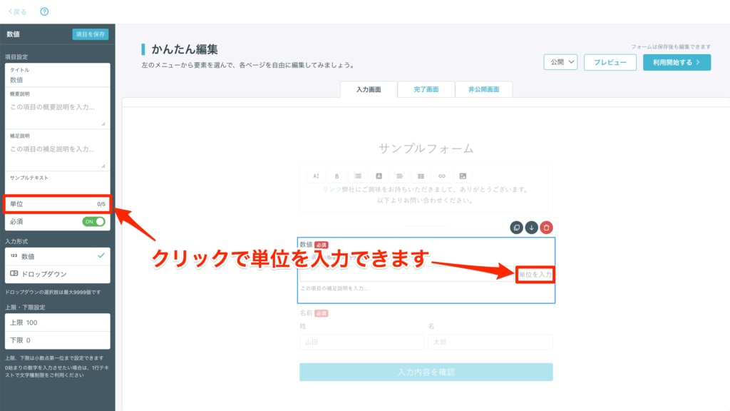
This is a function where you can enter numbers.
There are two input methods:
- Numeric
- Dropdown
You can also:
- Input decimal places
-
Input units
- Set upper and lower limits
If you want to enter decimals when answering the form, you can do so by entering decimals (up to one decimal place) in either the upper or lower limit settings.
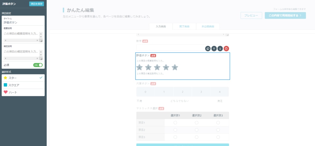
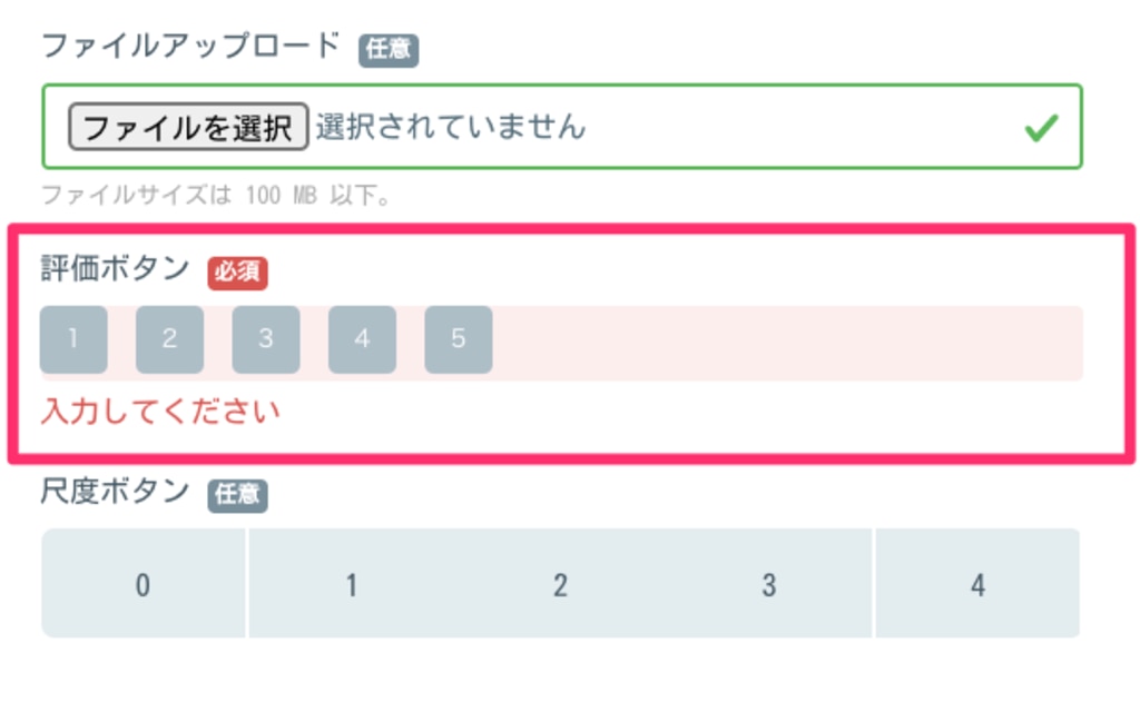
This is a function where end users can choose a rating.
For more details, please refer to this link.
If it is a required field and the submit button is pressed without an answer, an error will be displayed as shown below.
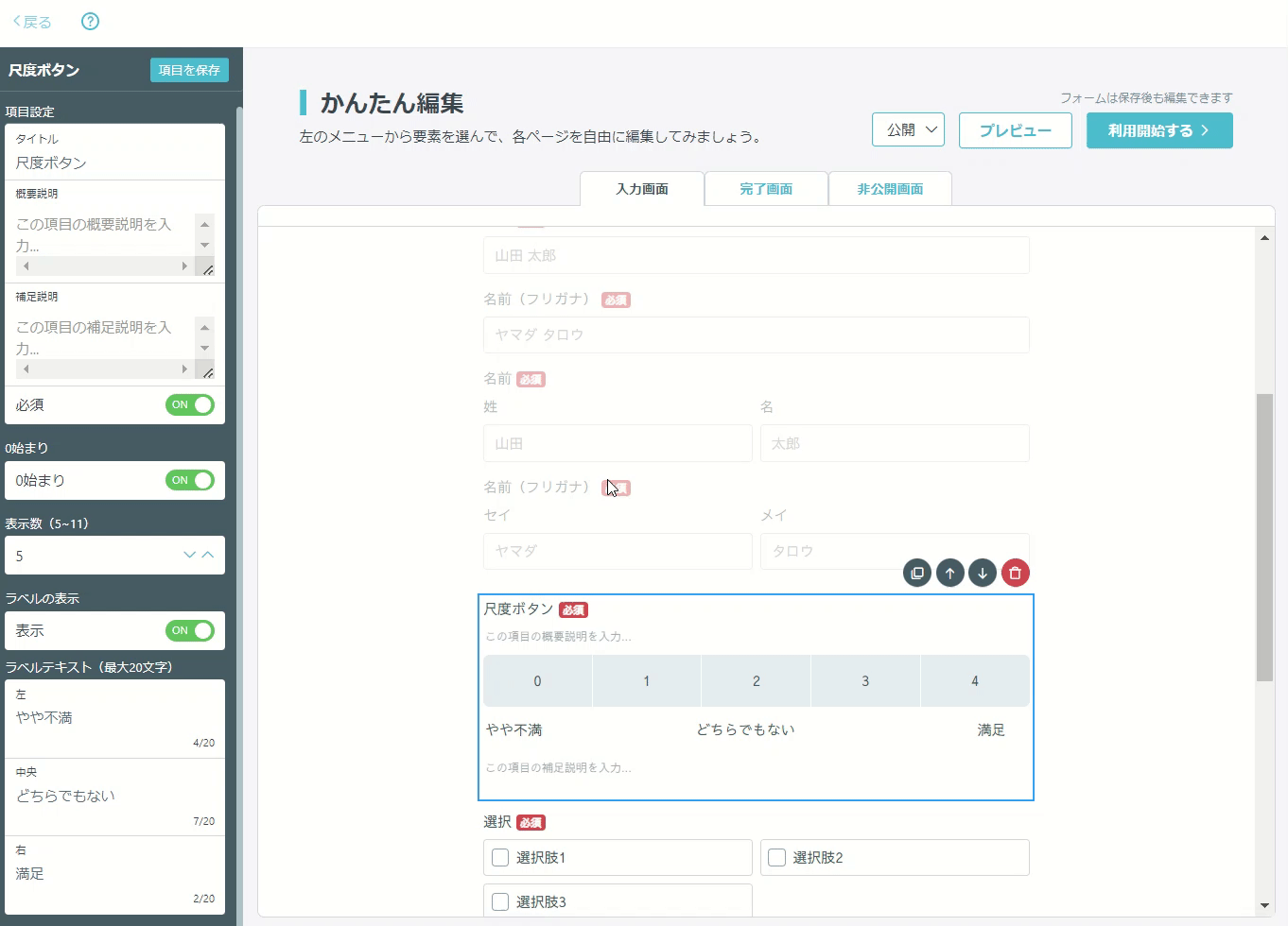
This is a function where you can set a scale, and end users can make selections.
For more details, please refer to this link.
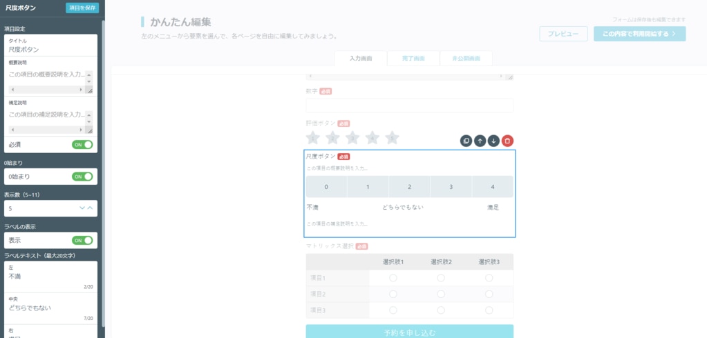
If it is a required field and the submit button is pressed without an answer, an error will be displayed as shown below.
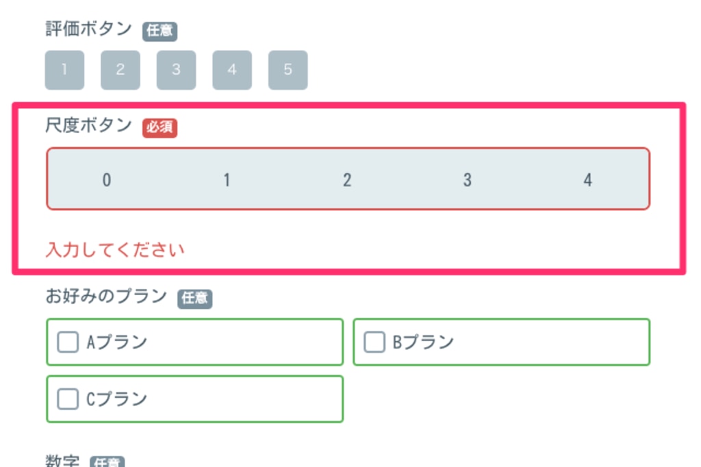
If you want to edit the label text, you can edit the text for each label in "Label Text".
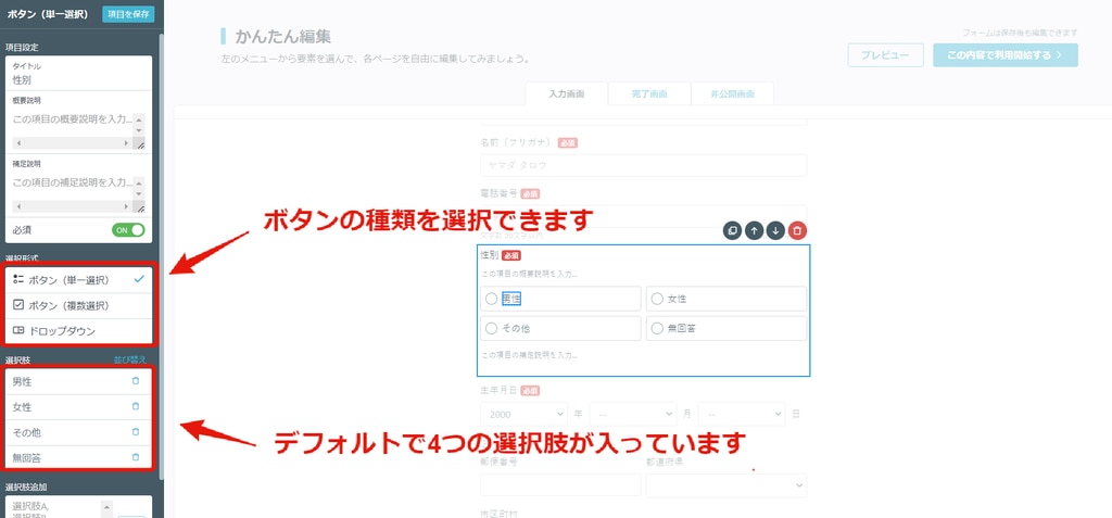
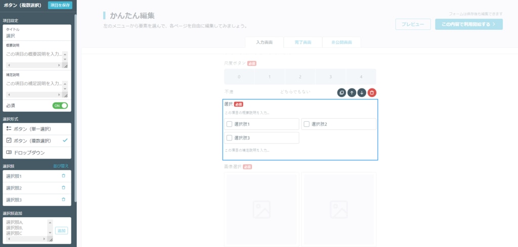
This field is used when asking form submitters to select one or more of the choices.
There are three selection formats:
- Button (Single Select)
- Button (Multi-Select)
- Dropdown
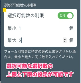
If you are using the BEGINNER plan or above, you can specify the upper and lower limits of the number of selections for multi-select.
Additionally, by enabling the [Add "Other"] option, form submitters can freely enter details in a designated space, which has no character limit.
If you want to add multiple choices, enter each option separated by a line break in the "Add choices" input space, and click the "Add" button to add them all at once.
If you want to reorder the choices, click "Sort by" next to "Choice" and you can drag and drop to rearrange them.
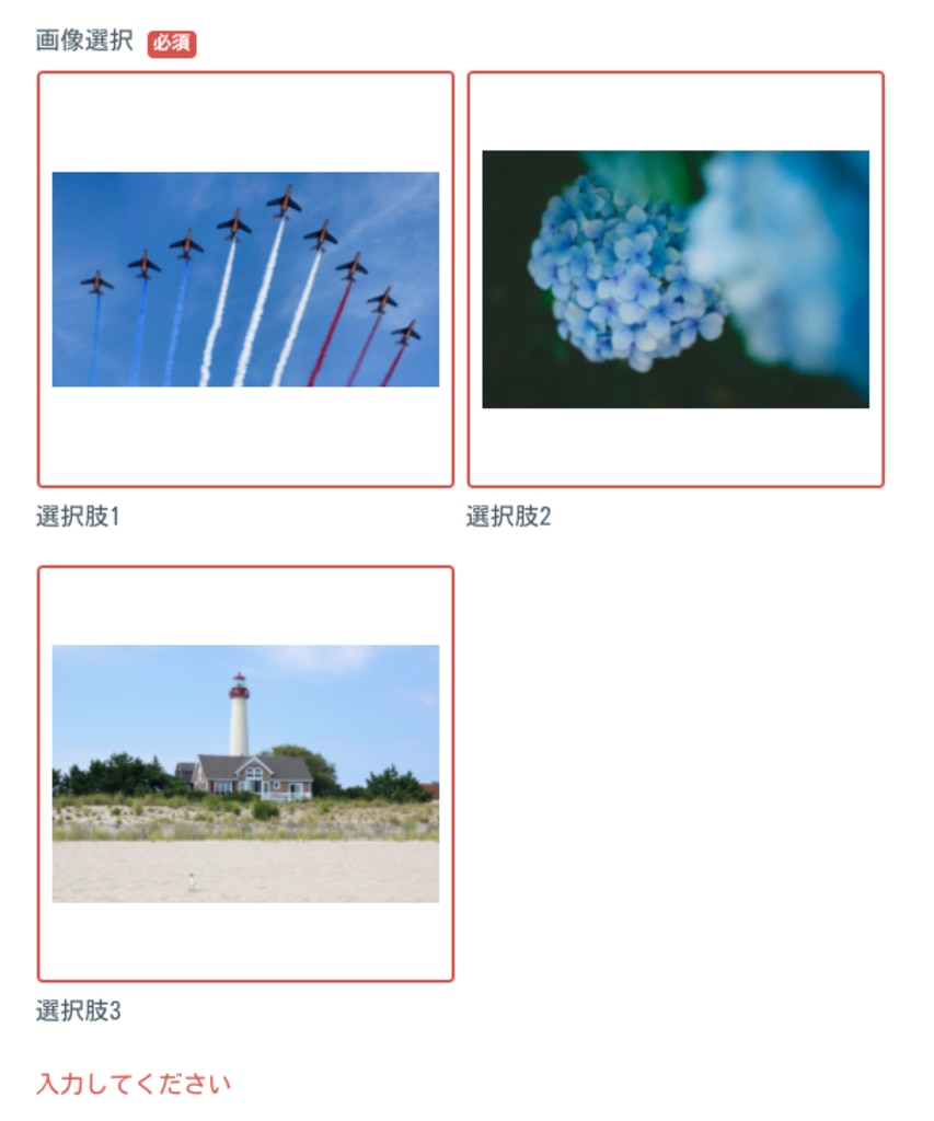
This is a function where end users can select uploaded image files.
There are two selection formats:
- Button (Single Select)
- Button (Multi-Select)
For more details, please refer to this link.
If you are using the BEGINNER plan or above, you can specify the upper and lower limits of the number of selections for multi-select.
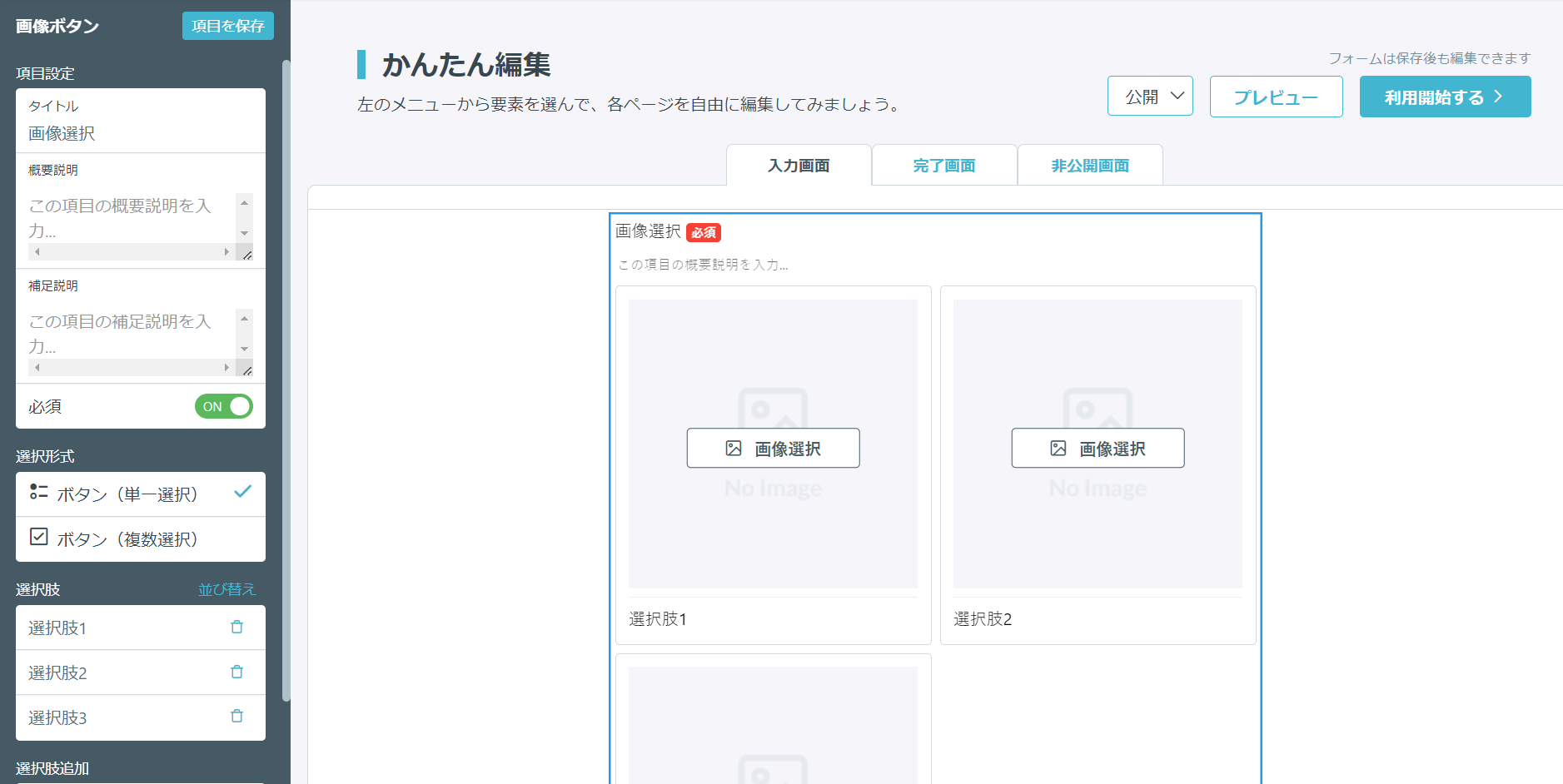
If you want to reorder the selection options, click "Sort Selection Fields" next to "Selection Fields" and you can drag and drop to rearrange them.
If it is a required field and the submit button is pressed without an answer, an error will be displayed as shown below.
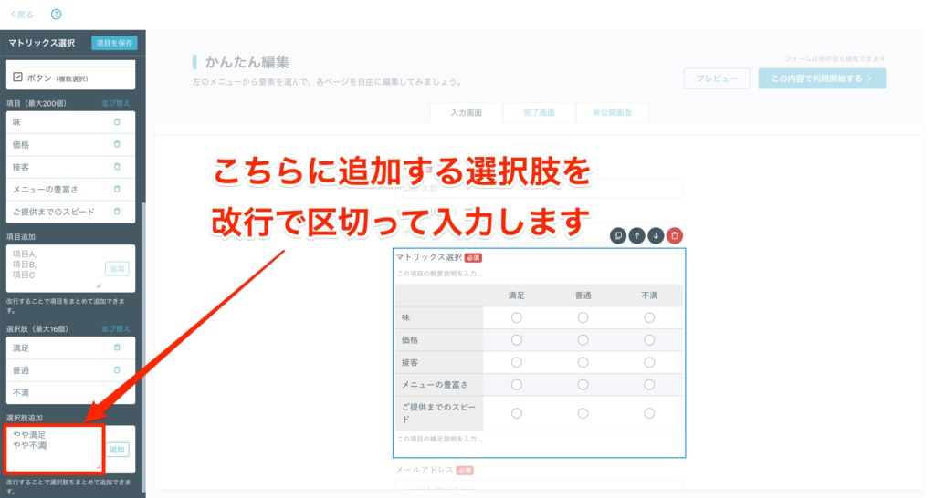
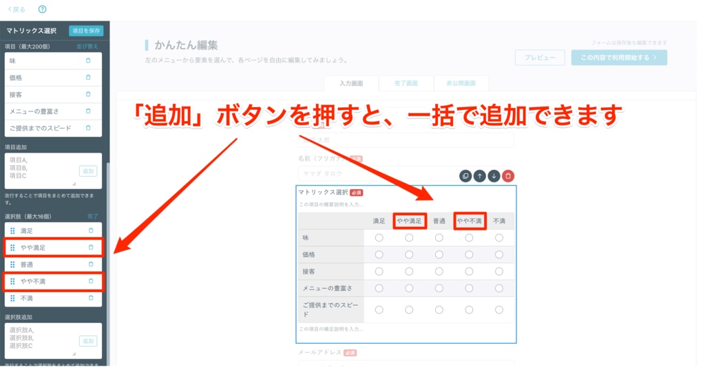
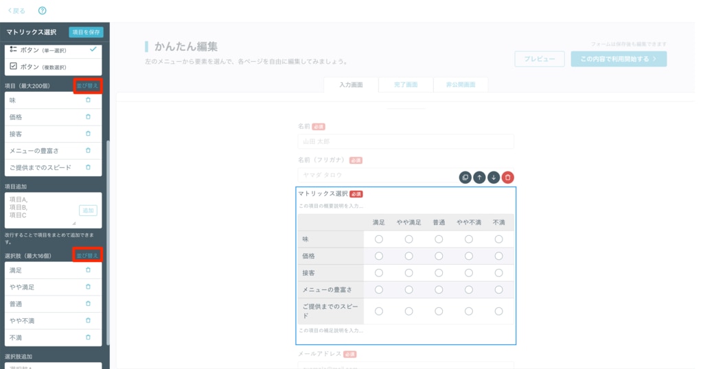
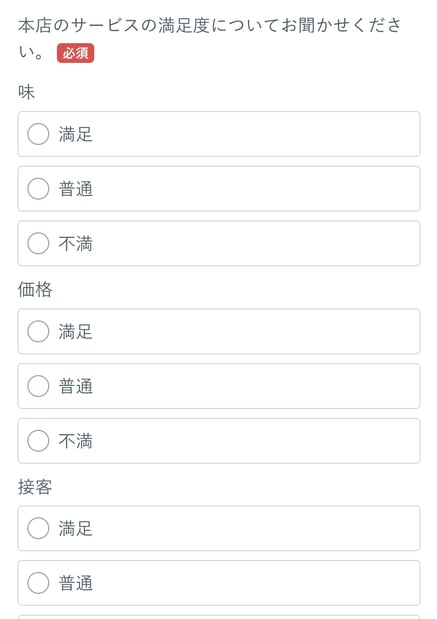
This is a function where you can set a "matrix" type question. You can set up to 200 fields and up to 16 choices.
There are two selection formats:
- Button (Single Select)
- Button (Multi-Select)
If you want to add multiple fields or choices, enter each field or choice separated by a line break in the "Add Fields" or "Add Choices" input space, and click the "Add" button to add them all at once.
▼To add fields:
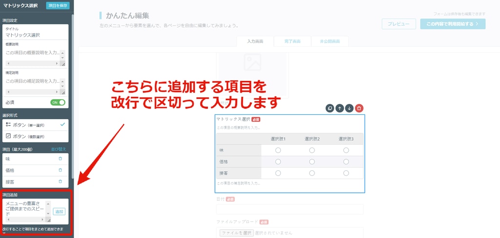
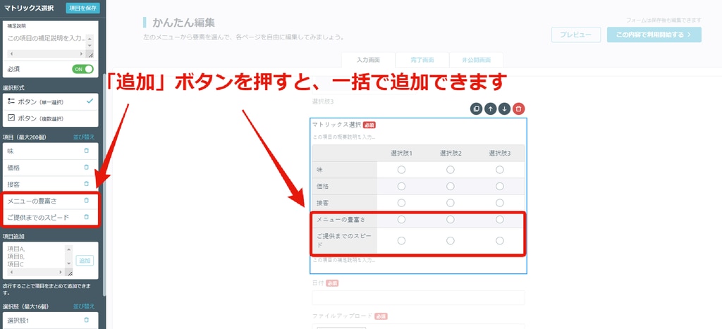
▼To add choices:
If you want to reorder fields or choices, click "Sort Fields (Max 200)" or "Sort Choices (Max 16)" next to "Fields" or "Choices" and you can drag and drop to rearrange them.
Please note that when displaying the public form on a smartphone, the format may be different from the display on a computer, and the choices will be displayed below the fields.
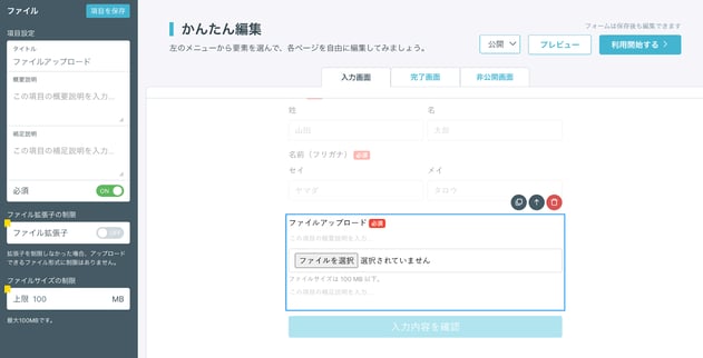
This is a feature that allows form respondents to upload image files, video files, etc.
Only one file can be attached to a single file upload field, so if you want to upload multiple files, please set up as many file upload fields as needed.
In paid plans, it is also possible to limit the file extension and file size as needed.
【File Extension Limit】
- You can specify the file extensions that can be uploaded when responding to the form.
※ If you do not limit the extension, there are no restrictions on the file formats that can be uploaded. - When restricting multiple file extensions, please input them with "comma" without spaces.
- You can specify the maximum file size that can be uploaded when responding to the form.
- Decimal units such as 0.1 can also be specified.
- Regarding the wording "File size is less than 100MB.", you cannot change or hide the non-numeric part.
※ For the maximum file size that form respondents can upload when performing file uploads, please refer to this.
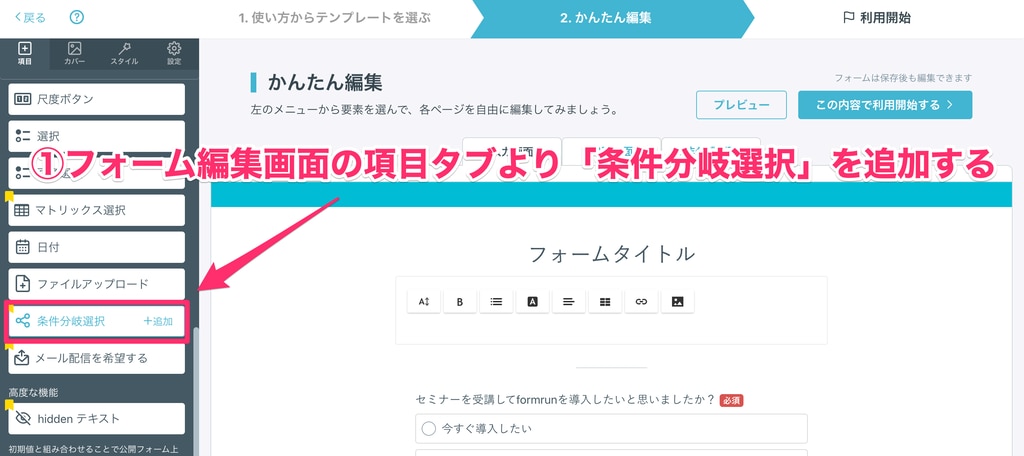
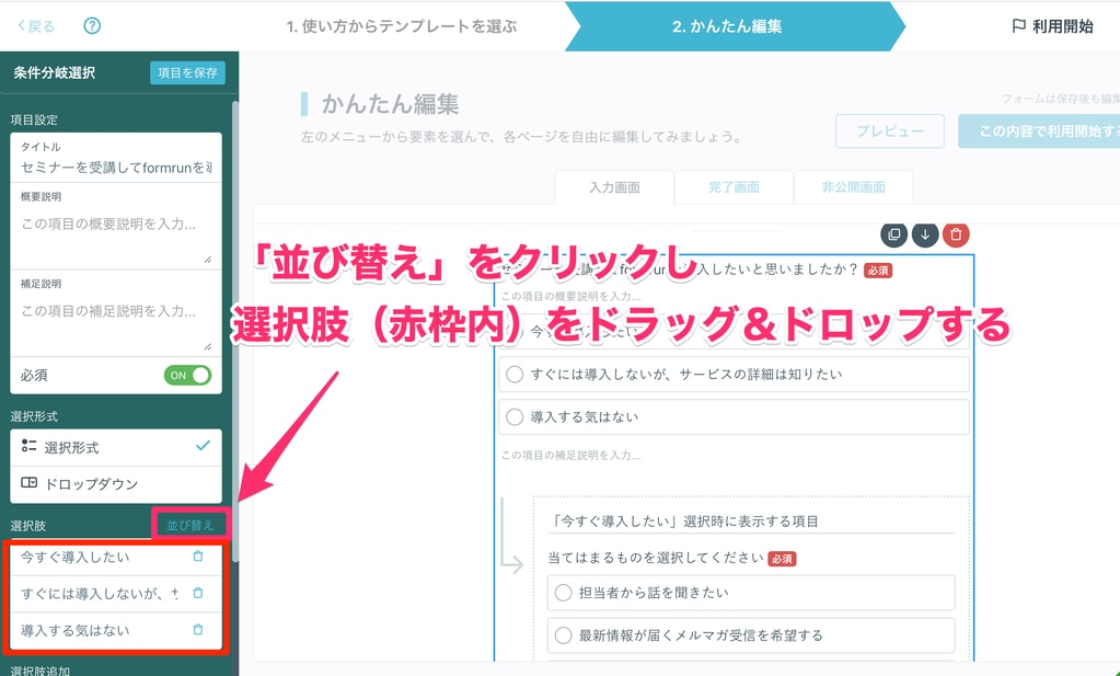
You can set conditional branch fields based on choices.
If there are fields that you want only those who selected a certain answer to respond to, please make use of the conditional branch selection field.
How to Set Conditional Branch Selection
You can set conditional branch fields by following the steps below.
- Add "Conditional Branch Selection" from the field tab on the form editing page.
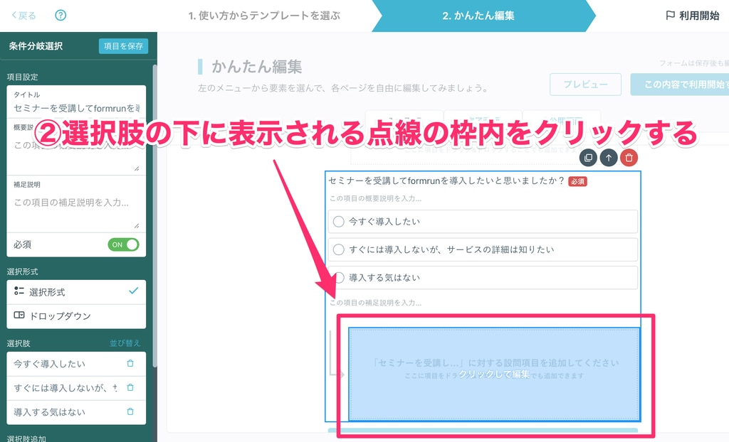
- Click inside the dotted frame that appears below the choices.
- Select or drag and drop the field you want to add from the field tab
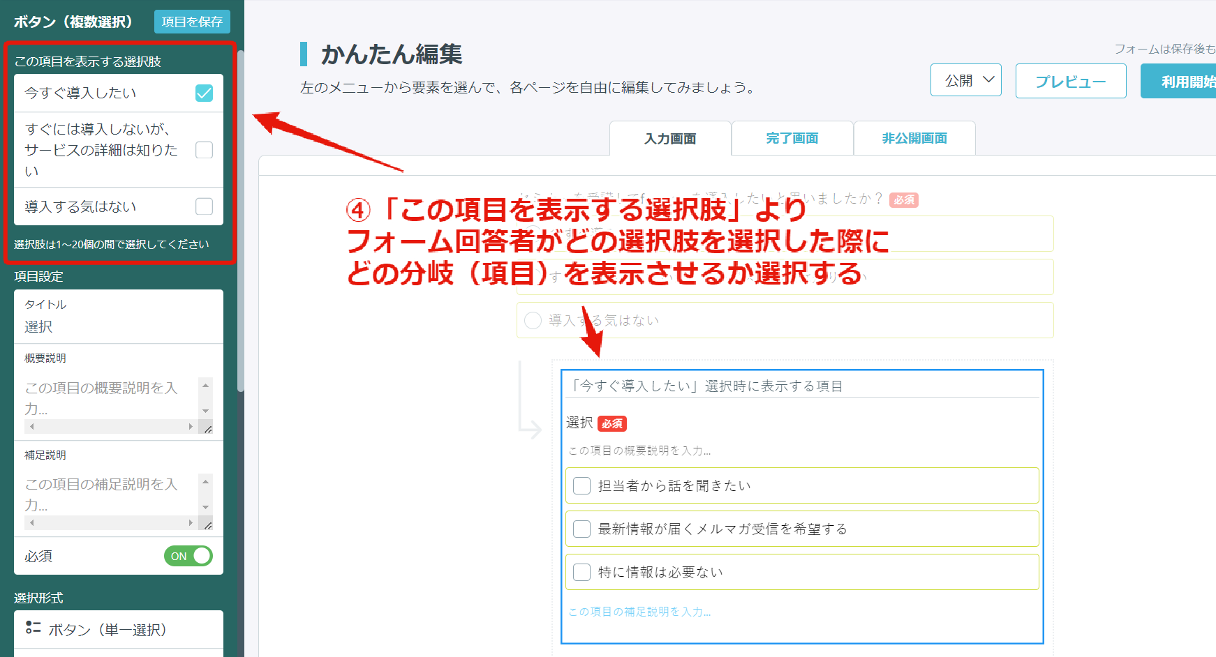
※ There is no limit to the fields that can be added. - From the "Choices to display this field" in the form tab of the corresponding field, select which branch (field) to display when the form respondent selects which choice. (You can select between 1 and 20 choices).

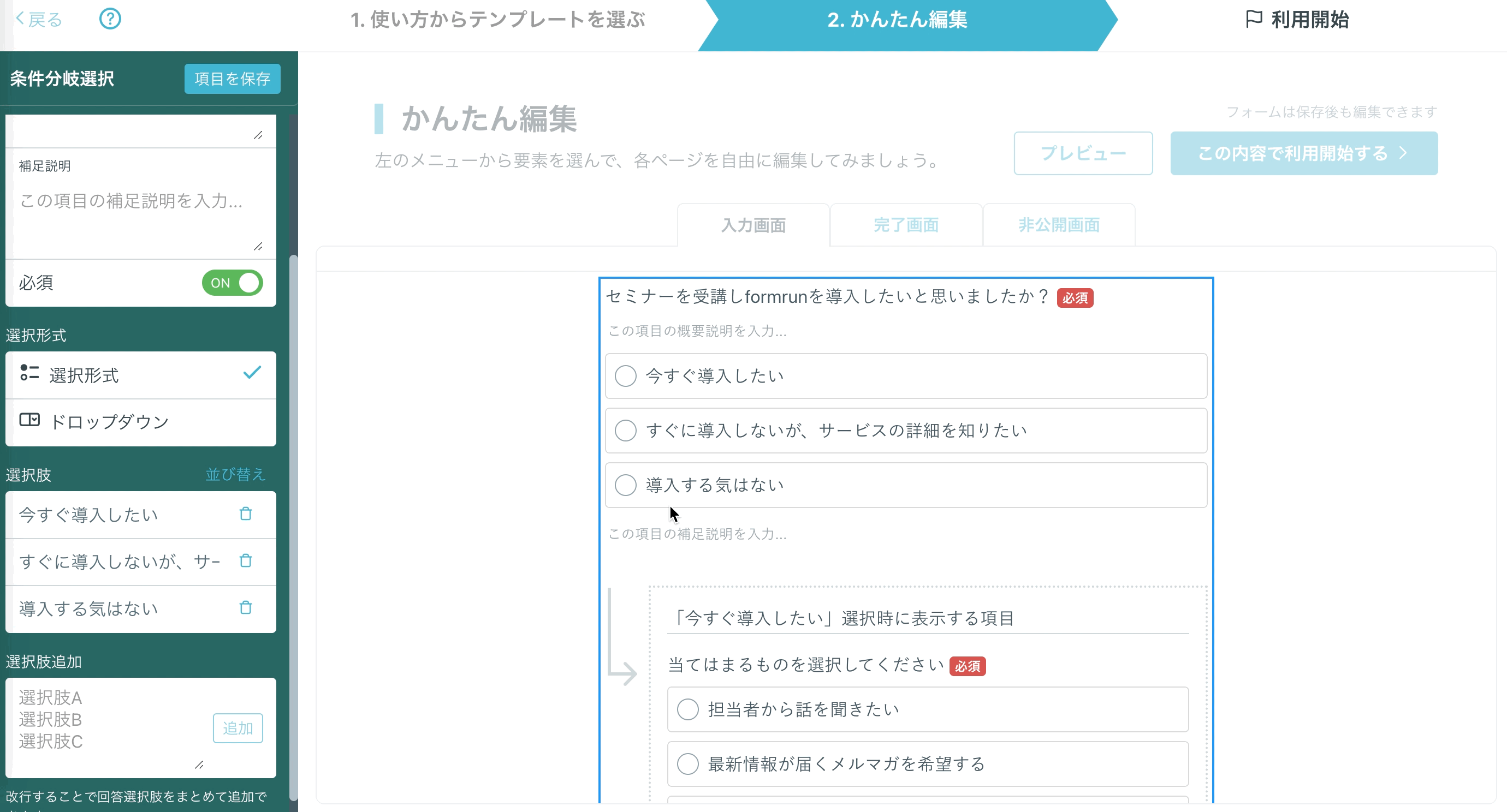
How to Set Conditional Branch with 2 Branches
By selecting and adding "Conditional Branch Selection" during step 3 of the above setting method, it is possible to set up a two-branch for sorting fields based on conditions.
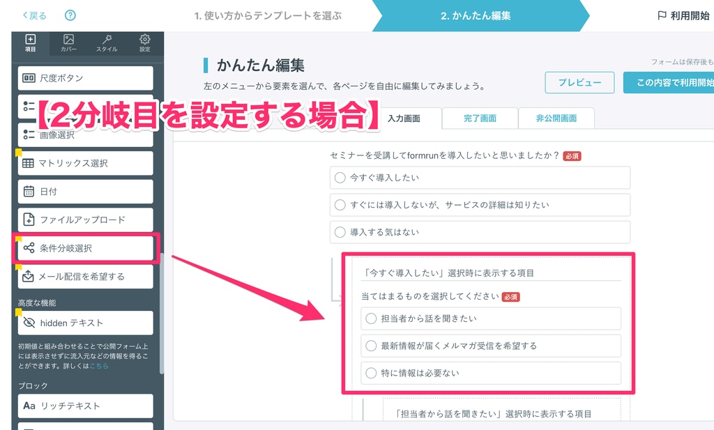
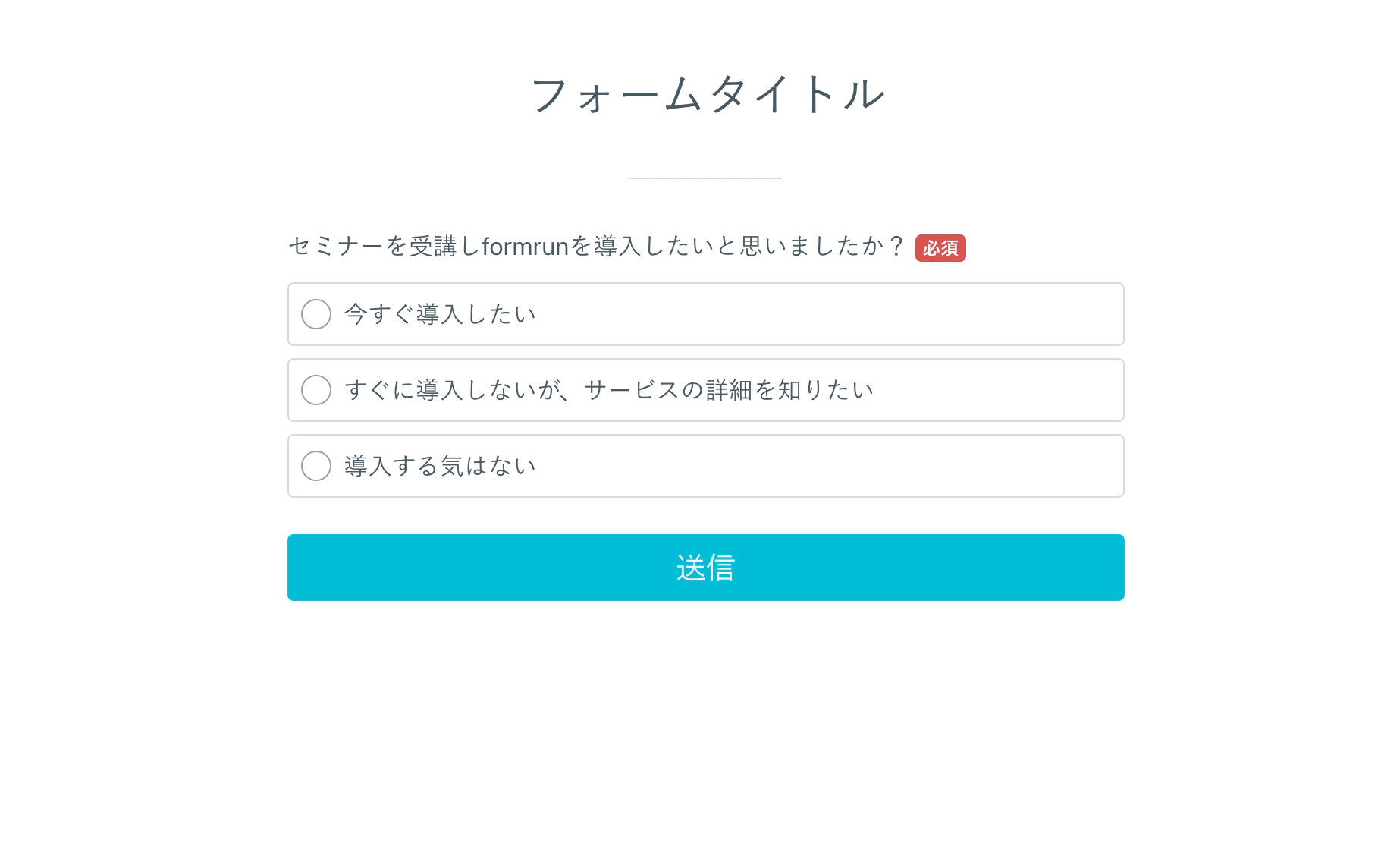
▼ Example of setting up to 2 branches
If you create a public form like ①, the form editing page will look like ②.
▼ ① Public Form
▼ ② Form Editing Page
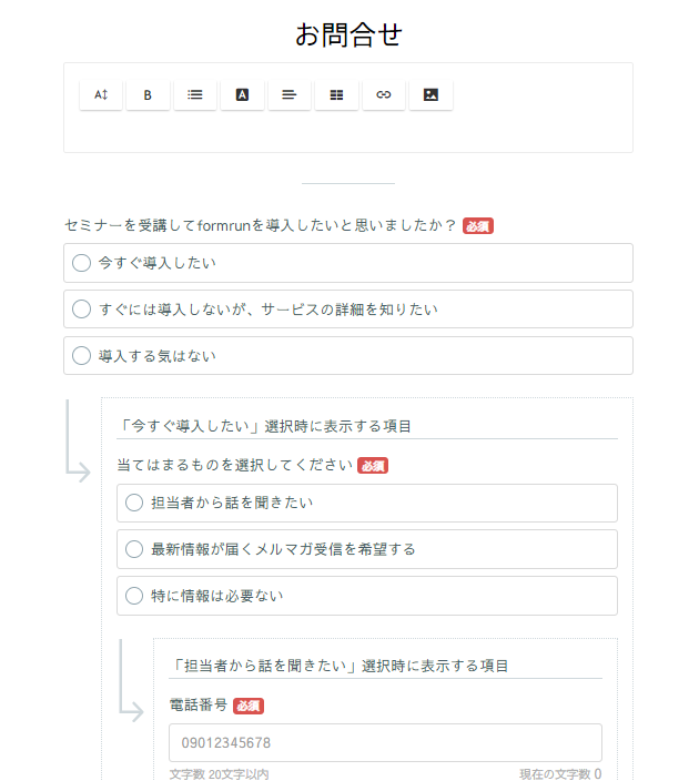
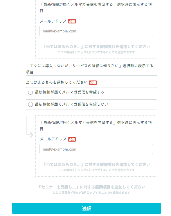
Click "Sort" next to "Choices" to drag and drop to reorder choices.
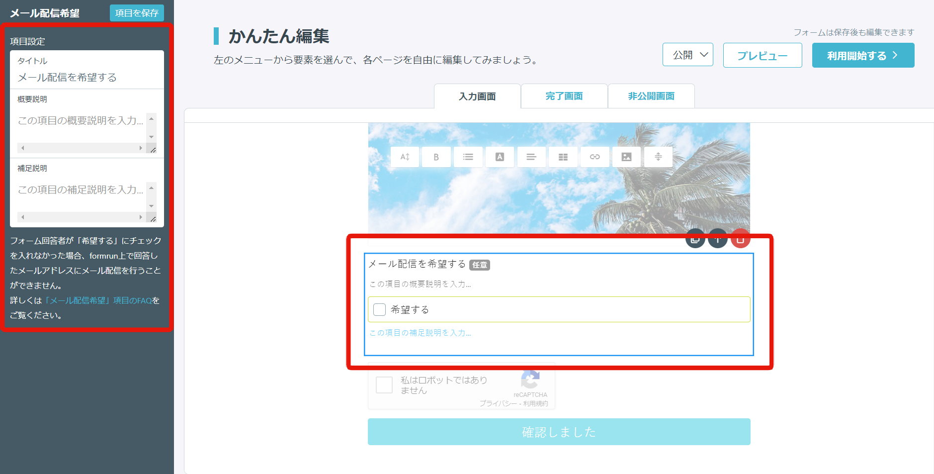
This is an field for customers who have responded to the form to agree to receive emails.
If you check "Yes," it will be "Available for delivery" on the delivery list, and if you do not check, it will be "Not available for delivery (opted out)" on the delivery list.
Note that it is an optional submission field, so it cannot be set as required.
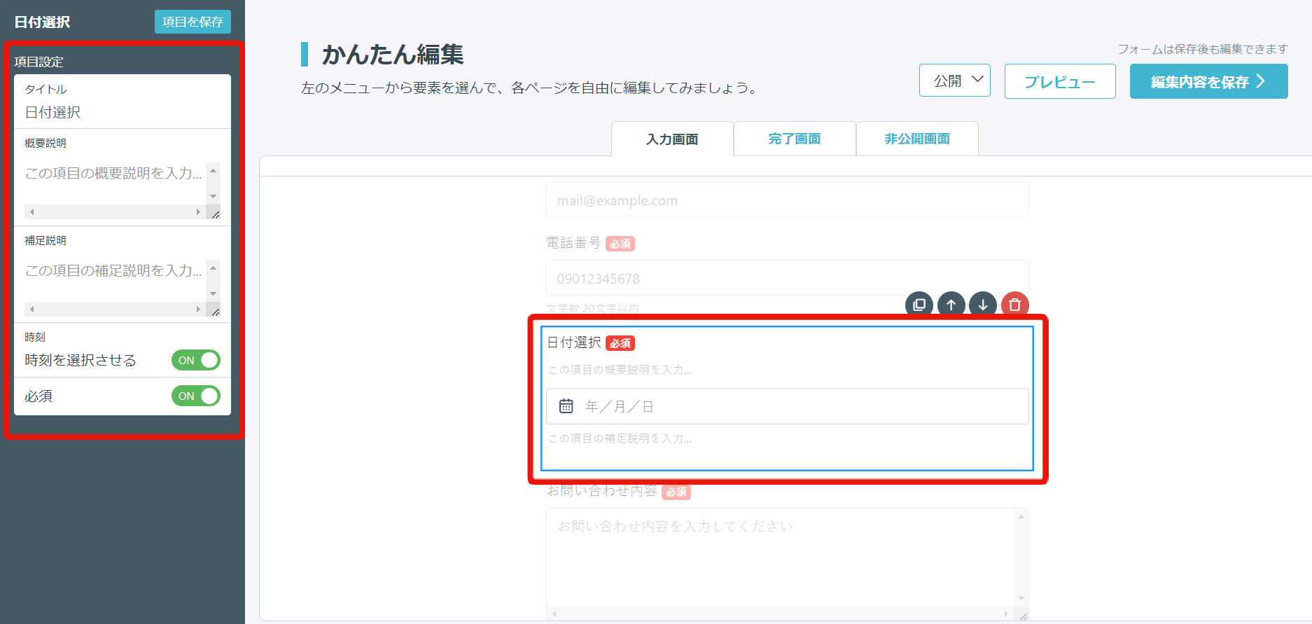
This is a function that allows you to adjust schedules.
You can change not only dates but also years and times.
For more details, please see here.
The following features are available with a paid plan.
・Limit the number of days of the week you can select.
・Limit the period of time you can select.
・Specify the period of time based on the date of form access.
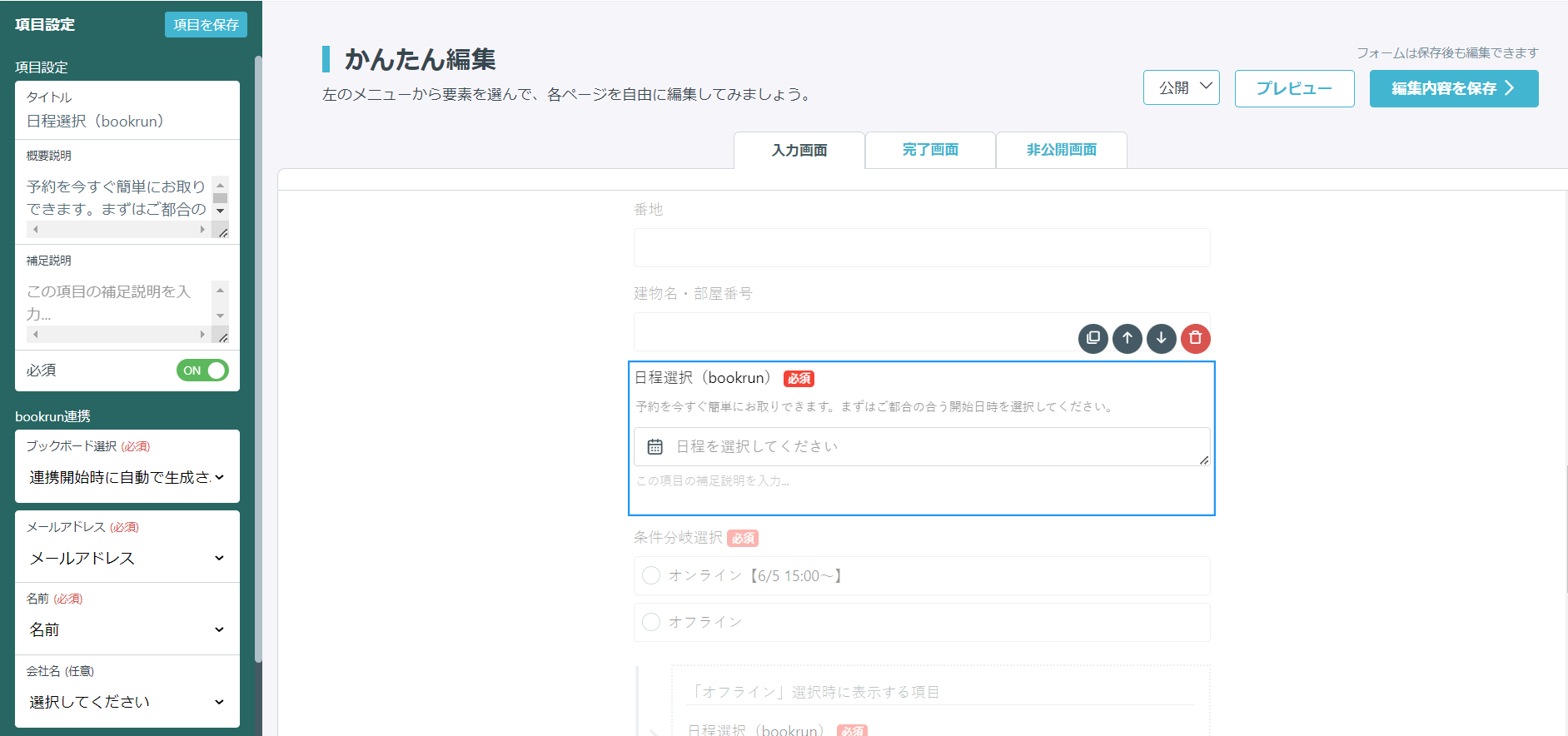
Date Selection (bookrun)
This is a function that allows you to adjust schedules by linking with Google Calendar and Microsoft 365.
You can embed a calendar that automatically extracts candidate dates and times from the schedule of the person in charge into the form.
※ The reservation information received will be managed within the bookrun system.
For more information about bookrun, please check here.
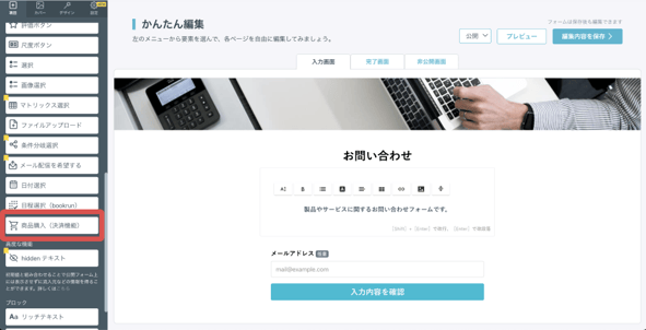
Product Purchase (Payment Function)
This is an field that allows you to display the registered product information on the form.
By linking with PayPal, you can use it as a form with a payment function by registering products.
For the overall procedure of the form with a payment function, please refer to here.
1. Click on the "Product Purchase (Payment Function)" field.
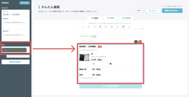
If the inventory set in the product setting page runs out, "Out of stock" will be displayed, and the product cannot be purchased.
In order to add a product purchase (payment function) field to the form, it is necessary to link with PayPal and register the product in the setting page.
For details of each, please refer to the following FAQs.
How to create a form with a payment function by linking with PayPal
How to set up product registration and shipping charges in product settings
Advanced Functions
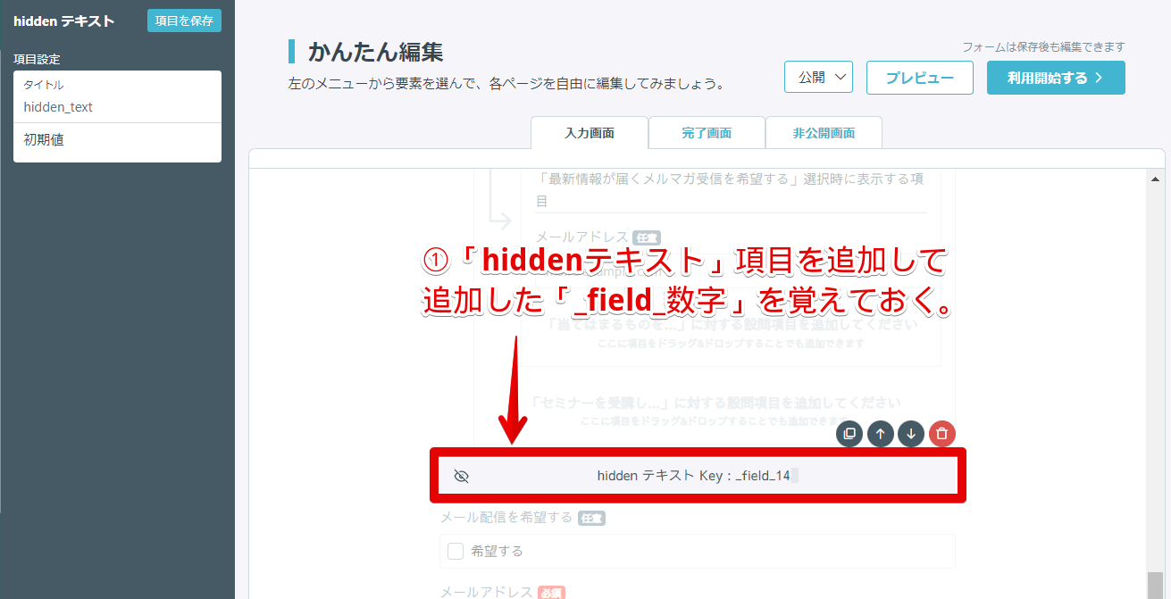
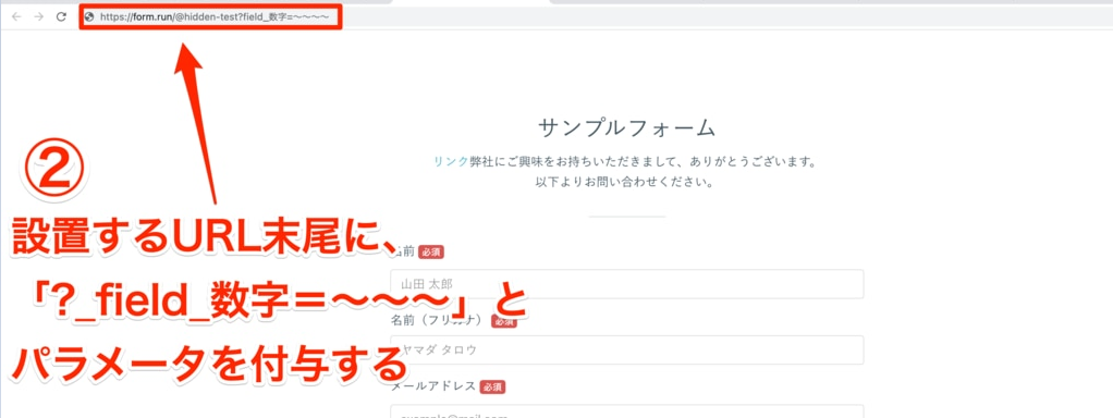
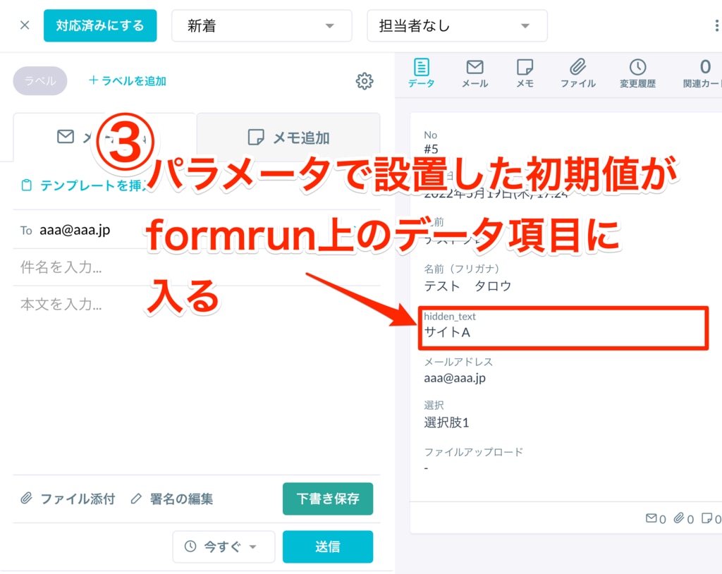
Hidden text is an field used in combination with setting initial values.
It is used when you do not want to display it as an field on the form for form respondents but want to obtain it as their data.
(Example) How to distinguish between forms set up on Site A and Site B
- Add the "Hidden Text" field
- Add "_field_number" of the added "Hidden Text" field as a parameter at the end of the URL of the public form as the initial value
- Confirm it as a data field on the formrun card
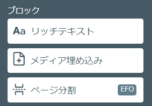
You can set up fields that do not require actions such as selection or input from the form submitter.
The basic fields are as follows. Click each field to set it on the editing page.
and tables and links can be added.
If you want to create a form with a rich design, please make use of the rich text field.
【Configurable Fields】
- Font size (10px〜30px)
- Bold
- List (numbered list, bulleted list)
- Font color (change text and highlight color with color picker)
- Text alignment (left, center, right, and justified)
- Insert table (add or delete columns and rows)
- Insert link
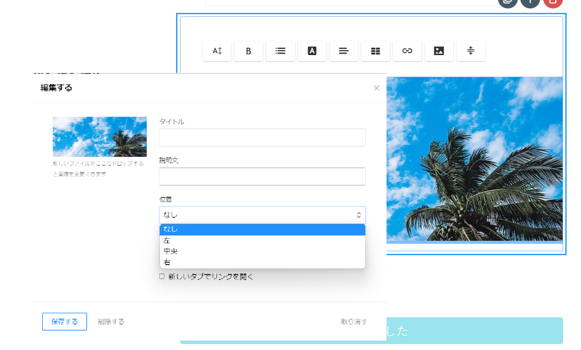
- Insert image (image title, description, position setting, insert link possible)
- Separator (insert horizontal line)
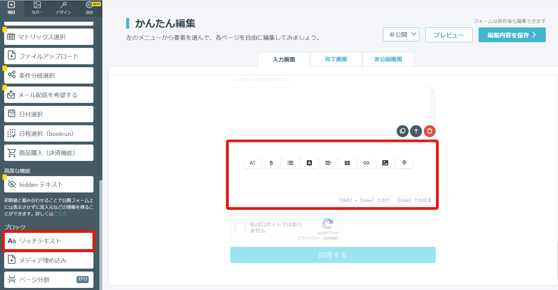
Image position can be set to "Left, Center, Right".
This is a function to embed media.
Enter the heading and the corresponding page URL of the web service (media) you want to embed.
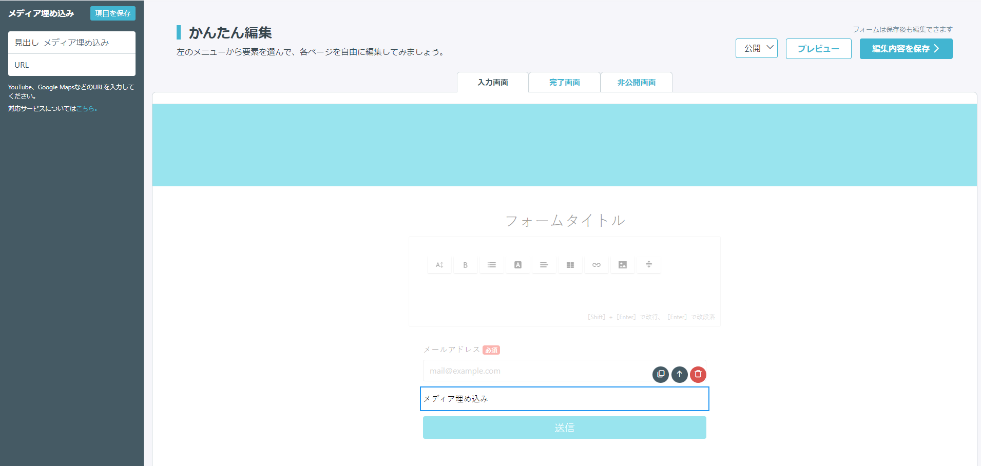
《Representative examples of embeddable services》
YouTubeVideos such as Viemo
Presentations from SlideShare
Maps from Google Maps
Encyclopedia information from Wikipedia, etc.
The current number of supported services is 501 types.
Also, it supports the "oEmbed" standard, so if it is based on the same standard, including X in addition to the list of supported services,
embedding display on the form is possible.
※ When using the media embedding function, please note that depending on the environment, the media may not be displayed correctly, and some URLs may not be supported.
About Description Text, Image, and Section
Description text, image, and section blocks have been discontinued.
In the future, please use the Rich Text block.
Others
You can edit the text message of the form submit button and the width of the button.
You can edit the message by clicking the form submit button. Please note that if you leave the button text field blank and press the submit button, a warning will be displayed indicating that it is not filled in.
You can select the button width from small, medium, and large.